Art History

A Conversation with Art Herstory's Erika Gaffney

Anyone who has studied art history can attest that much of the work included in major textbooks and courses is still dominated by men. The project to bring stories of women artists to light has been going on in earnest since the mid twentieth century and there are many scholars and organizations contributing to this important work. One such endeavor is Art Herstory, the brainchild of Erika Gaffney. She brings to light work by women artists on multiple platforms - from stationary dedicated to historical makers, to social media posts that buoy contemporary women artists. Erika earned a BA from St. John’s College and pairs her work on Art Herstory with a career in publishing. I had a conversation with her about the work she is doing.

Can you share some of your personal and educational background? How do you come to the work you are doing?

Art Herstory Founder Erika Gaffney

My BA is in Liberal Arts, and I am an acquisitions editor in scholarly publishing, working mostly on books to do with early modern studies and/or art history. Art Herstory has flowed naturally from my job: there are many scholars in my network who work on early modern women, including some who study women artists, specifically. And my work in art history publishing ensures that I am comfortable navigating permissions issues.

How did Art Herstory get started and what is the goal of the project?

In Fall 2017, I was inspired to send a “real” (paper) birthday card to a feminist art historian friend. I wanted to send a card featuring a painting by a Renaissance woman; but it took a long time to find one. The lack of availability of cards reproducing works by historic women artists really bothered me. Art Herstory began with the goal of supplying such cards. But it grew organically—the project does seem to have a mind of its own!—to support the movement to recover the names, works and stories of history’s women artists accessible to today’s art-loving public.

How do you think sharing stories of these women artists shifts perceptions or changes the history of art?

My favorite answer to this question must be credited to historian Merry Wiesner-Hanks, the author of the very first Art Herstory guest post. In Why Do Old Mistresses Matter Today?, she writes, “… a failure to take female Old Masters into account leaves us with a short view, which impoverishes the question and limits our understanding.” It is important to remember that many of the women who almost vanished from art history were not only talented, they were famous in their time. Their work was sought after by kings and popes! How can we gain a full and balanced understanding of our art historical heritage, when whole segments are erased, and on completely arbitrary grounds?

Can you talk about the role of note cards in the work you are doing?

One idea behind the note cards was to invest historic women artists with the trappings of success, in a sense. Another was to use note cards to expose historic women artists to an audience of art-lovers who, if only they had the chance, would love to learn about women artists who have been hidden in the shadows of history. Unfortunately, historic women artists as a theme doesn’t seem compelling enough for museum shops to carry such cards year round. But happily, these days more and more museums are hosting temporary exhibitions about female makers, and some museum shops have at least sold Art Herstory cards in support of such shows.

Art Herstory stationery on display

Does the work of Art Herstory go beyond Old Masters?

Oh yes! While Art Herstory note cards are limited to Old Masters, at least for now, Art Herstory holiday cards reproduce art by women from later periods. For blog post topics, the only restriction is that the artist be deceased—admittedly it is an arbitrary limitation, but Art Herstory is a one-person, volunteer operation and I had to draw the line somewhere. And women of all periods feature in Art Herstory social media posts; in the quarterly “new books about women artists” round ups; and in most segments of the monthly newsletter.

What is something you have learned in the process of coordinating Art Herstory?

I’ve learned so much—about women artists and art history, but also about more practical matters. Managing the blog on the website, I’ve learned (to an extent from my college-age daughter) about search engine optimization and readability scores. I’ve learned how to post new products, run an Etsy store, generate a presence on social media, and ship orders from my home. I’m still trying to get up to speed on the best way to work with museum- and bookstore buyers. To give just three examples of things I’ve learned in an art history context: I’ve discovered that a much larger percentage than I would have imagined of botanical artists are—and were—female. I know more now about saints’ attributes than I would ever have imagined. And very specifically: I learned that in their time, flower painter Rachel Ruysch enjoyed far more commercial success than Rembrandt!

What has the feedback been from people who have interacted with Art Herstory?

The people I’ve heard from—by email, or on social media—are grateful to have access, in some cases at long last, to information about women’s artistic achievements throughout history. Some people—of all genders, from multiple cultures and backgrounds—are sad, sometimes even outraged, that women were largely absent from their high school and college textbooks and lectures. And in terms of products, overwhelmingly customers have expressed appreciation for the quality of the cards, as well as for the idea behind them.

How can people support the work you are doing?

Here are some ideas:

  • Buy cards! They truly are high quality stationery products, and they make a unique gift. Revenues help to offset the project’s considerable expenses. Readers can shop online at the shop on the Art Herstory website and/or from the Etsy store.

  • Follow along on social media: Art Herstory is on Instagram, Facebook, Bluesky, and (at least for now) X.

  • Subscribe to the (free) monthly newsletter: go to the landing page, scroll all the way down, and enter your name and email address into the short form at the bottom of the page.

  • Propose new products: what kinds of items do you purchase regularly, on which you’d like to see art by historic women?

  • Read Art Herstory blog posts, contribute guest posts, and/or write comments on posts by other writers.

  • Spread the word about Art Herstory – on social media, among friends, or (for teachers at all levels) within the classroom!

What is next for Art Herstory and for you?

For me, I will continue to publish books about women artists, as well as blog posts—my Art Herstory work integrates seamlessly into my work on the book series Illuminating Women Artists. For Art Herstory, I’d like to produce more in the way of non-card products. I’m contemplating a monthly wall calendar, themed around one or more historic female artists. But, not in a position to fund such a project on spec, I might launch a Kickstarter campaign.

A collection of images by women artists used for holiday cards by Art Herstory

Exhibition Charts Rembrandt's Printmaking Mastery

Rembrandt van Rijn (1606 - 1669), is known in popular memory for his emotionally charged portraits as well as for paintings of historical, mythological, and religious subjects, which exemplify the heights of Baroque drama and narrative. He was also a consummate draftsman and skilled printmaker. At the Worcester Art Museum through February 19, an impressive survey of the artist’s etchings shows off Rembrant’s talents and offers audiences an opportunity to learn about the thrilling qualities of printmaking as an artform.

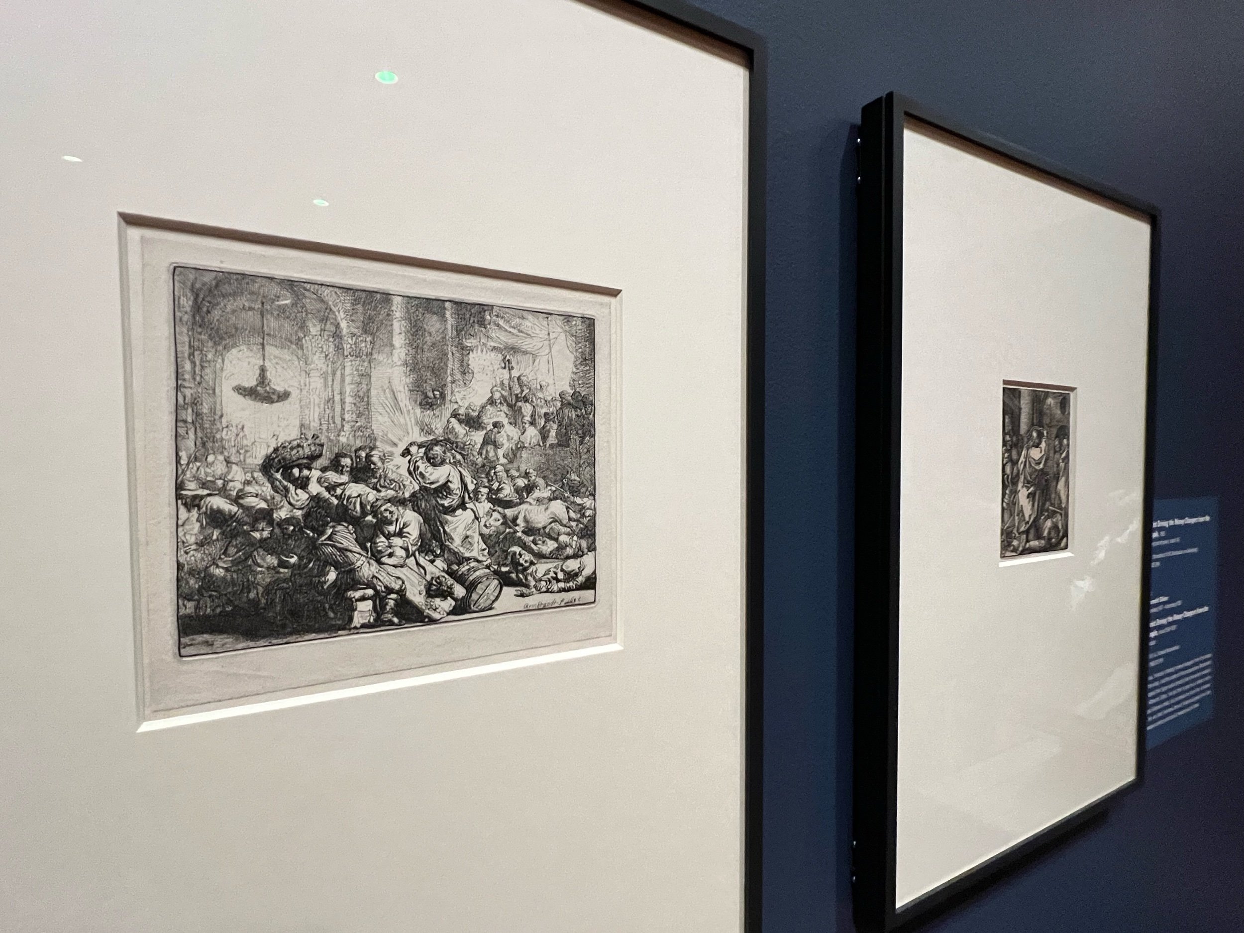
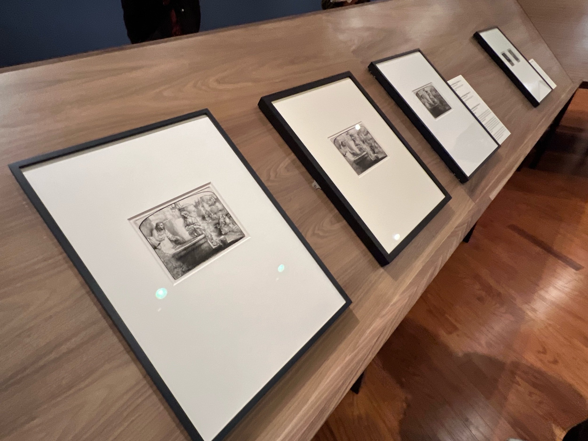
Rembrandt: Etchings from the Museum Boijmans Van Beuningen features some seventy works on paper by the exhibition’s titular artist as well as ancillary artworks by those who studied directly under him or found themselves in his circle. The Museum states that the exhibition is one of the largest focused on the artist’s etchings to visit the United States. A remarkable show in many respects, the exhibition is exciting for those interested in the history of the print as well as in the history of Dutch art. It also illustrates the way in which Rembrandt leveraged the power of the print to rise to the apex of popular culture in his own day.
A detail of Rembrandt’s Christ Blessing the Children and Healing the Sick, from about 1648.

One of the throughlines found in many of the pieces on view in the exhibition is Rembrandt’s keen sense of draftsmanship. His drawing skills naturally come across in his printmaking and even the subtlest of images bears this out. In some of the prints, tiny landscapes with minute figures read as larger vistas and in others the personalities of sitters are captured by Rembrandt’s distinctive portraiture. Close-looking unveils the artist’s facile hand and refined use of line and cross-hatching to create illusionistic and complex images.

Rembrandt’s Landscape with Square Tower, from 1650. A shaped plate gives this print its undulating edge.

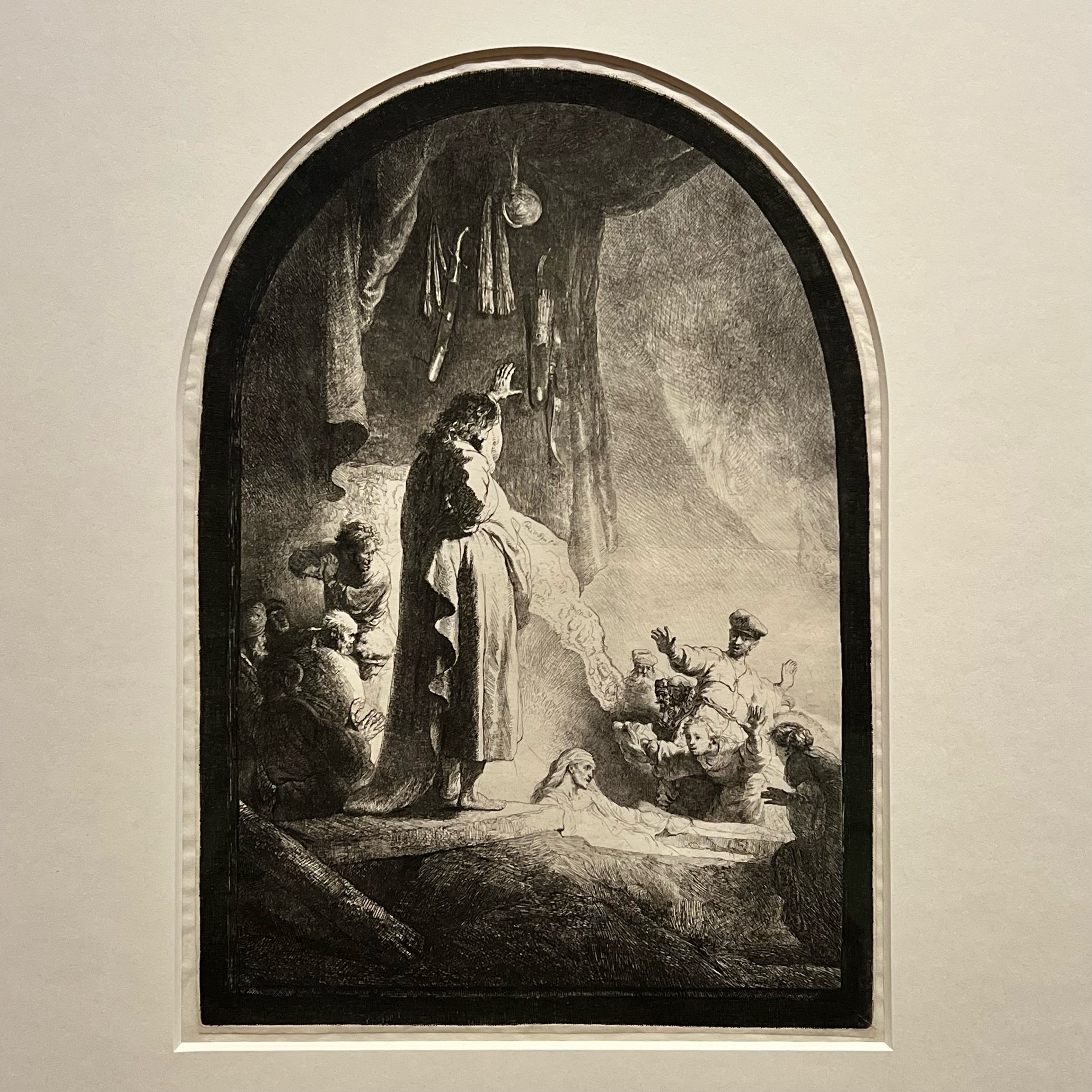
Recurring favorites are found in multiple richly inked and dark prints. One can imagine the ways in which the candle-lit murk of the Dutch seventeenth century impacted Rembrandt’s way of making images and nocturnes or sparsely lit interiors are some of the exhibition’s most enthralling examples of what printmaking can do in the hands of a great practitioner.

A 1642 etching of Saint Jerome in a Dark Chamber shows off Rembrandt’s mastery of light and dark.

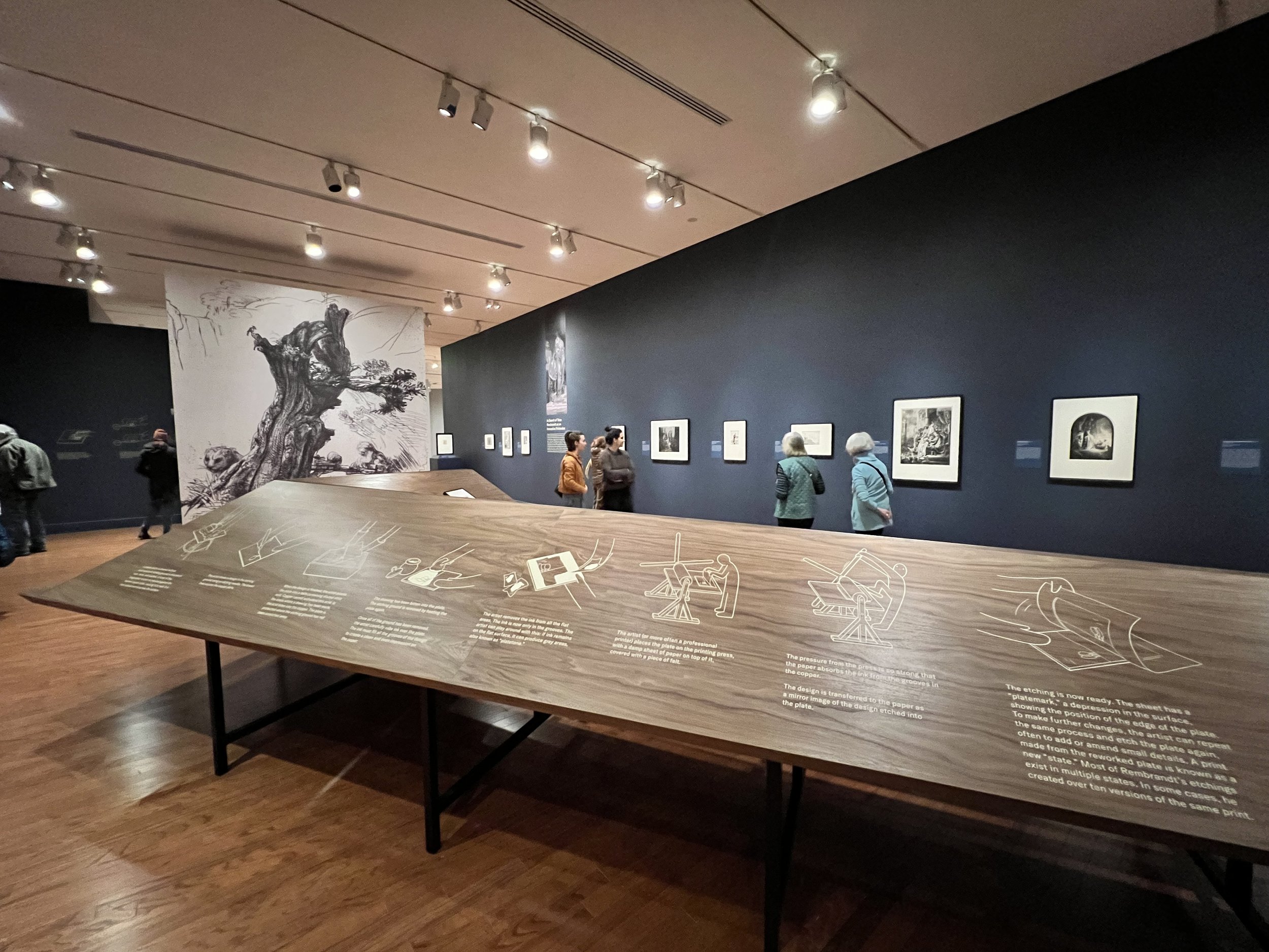
Another of the assets of this exhibition is its underlying focus on technique. With so many examples of work on display, the show also includes paper samples, explanations of tools and printmaking methods, as well as plates. A central space in the show is dedicated to the steps of making prints, which will give even a consummate print-lover things to consider. For those who are newer to etchings or to printmaking in general, this aspect of the show will provide a new appreciation for the uniqueness of prints. In their own day and now, these artworks are sometimes wrongly considered secondary to painting or sculpture.

A central component of the exhibition highlights the tools and techniques behind the prints on view.

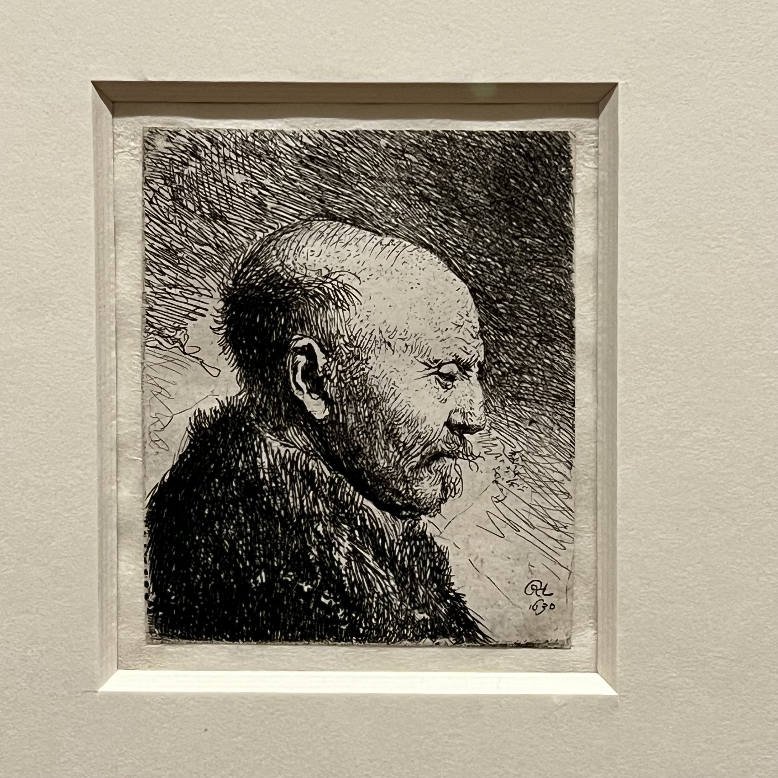
While he is rightly renowned for his skills as a painter, the sensitivity of Rembrant as a person does not lose any of its impact in the etchings presented in this show. Frail and thoroughly human bodies, full of fleshy corporealness, come up again and again in Rembrandt’s work and they are present here. Faces that bear the deep lines of laughter and tears are also present and bring viewers nose-to-nose with their long-dead counterparts. To look at these prints is to be confronted with human experience in all of its rich complexity.

An image of a Head of a Bald Man Right, dated 1630, exemplifies Rembrandt’s sensitivity to the human experience.

For those who love Rembrant, Etchings from the Museum Boijmans Van Beuningen will reassure them of Rembrandt’s distinctive voice and impressive expertise as an image-maker. For those who are new to the Baroque, to printmaking, or to Rembrandt, the show has the potential to be revelatory. Either way, it is a joy to be immersed in the world of Rembrandt’s masterful etchings.

Rembrandt: Etchings from the Museum Boijmans Van Beuningen is on view at the Worcester Art Museum through February 19, 2024. The Museum is located at 55 Salisbury Street in Worcester and is open Wednesdays through Sundays from 10am - 4pm. Learn more at www.worcesterart.org. See additional views of the show below.

The Enduring Allure of Small Artworks

As that time of year nears when many arts organizations host shows and sales of small artworks, it is interesting and timely to consider the historical tastes for little pieces of art. While the impending holiday season might bring exhibitions of smaller sized works to venues across the country, collectors have prized small art for centuries and the trends in modestly sized artworks have shaped art history more generally as well. Highlights from the history of art can serve as inspiration for contemporary patrons to add intimately scaled artworks to their collections.
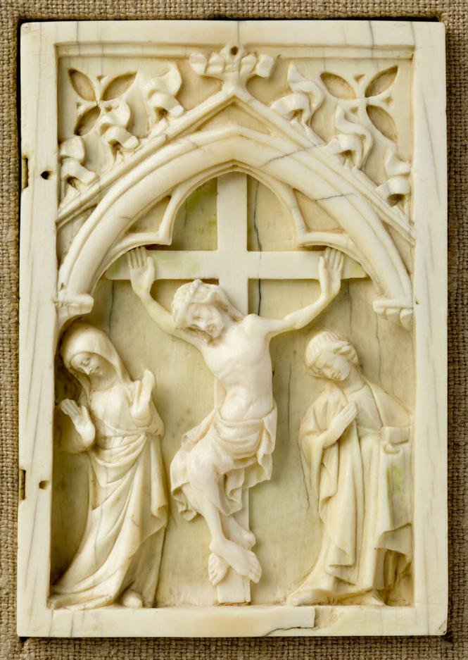
Unknown maker, Right Half of a Diptych: Crucifixion of Christ, French, c. mid1300’s, carved ivory, 10.5 x 7.3 cm (4 1/8 x 2 7/8 in.), Collection of the Worcester Art Museum

In the medieval period, art patrons were high status nobles whose lives were consequently nomadic. Travel between varying estates or to the court meant that precious works had to be mobile. Some of the most treasured artworks of the middle ages were tapestries that could be rolled and taken away. Because small objects are particularly easy to move, an entire industry sprung up around the creation of things like minute ivories that acted as tiny altars for personal Christian devotions.

France become a central location for the production of these sacred objects. Diptychs and triptychs were produced and filled with exquisitely detailed scenes from the lives of the Virgin Mary or Jesus Christ. Originally richly colored with polychrome, most medieval ivories were denuded over the centuries and now exist primarily as sculptural objects and testimonies of religious faith and artistry. For those looking to learn more about this tradition of these small ivory reliefs, the Courtauld Institute’s Gothic Ivories Project is a remarkable storehouse for research and photography.

While little ivories were exceptionally popular, the medieval world was full of small but precious things like remarkable jewelry, works of decorative arts, and tiny books of hours packed with intricate illustrations. All of these objects enable historians to get a picture of social and economic realities for those who commissioned and treasured them.

John Singleton Copley, Self-Portrait Miniature, watercolor on ivory, 1769, 1 3/8 x 1 1/8 in. (3.3 x 2.7 cm), Collection of the Metropolitan Museum of Art

Later, in the eighteenth century, another form of small art rose in stature. Items like miniature portraits and highly detailed snuff boxes came into vogue. Pieces like these were also manufactured for the upper echelon of society and were often given as love tokens or other gifts. Although small in scale, they are wonderfully illustrative and help to form a vivid picture of the social world of their time.

In a small self portrait in the collection of the Met, American artist John Singleton Copley captures his own likeness in the tiniest way. Undeterred by the small size of his ivory canvas, Copley created an image of himself that captures his fine clothes and well-coifed hair. Rosy subtleties play across his otherwise alabaster skin and the effects of light and shadow are explored in ways that are as in depth here as they might be in a larger scale work.

While miniatures like Copley’s were particularly popular in his day, there is a long tradition of their production. A detailed catalogue focused on earlier works of miniature portraiture in Europe is available via the Metropolitan Museum online.

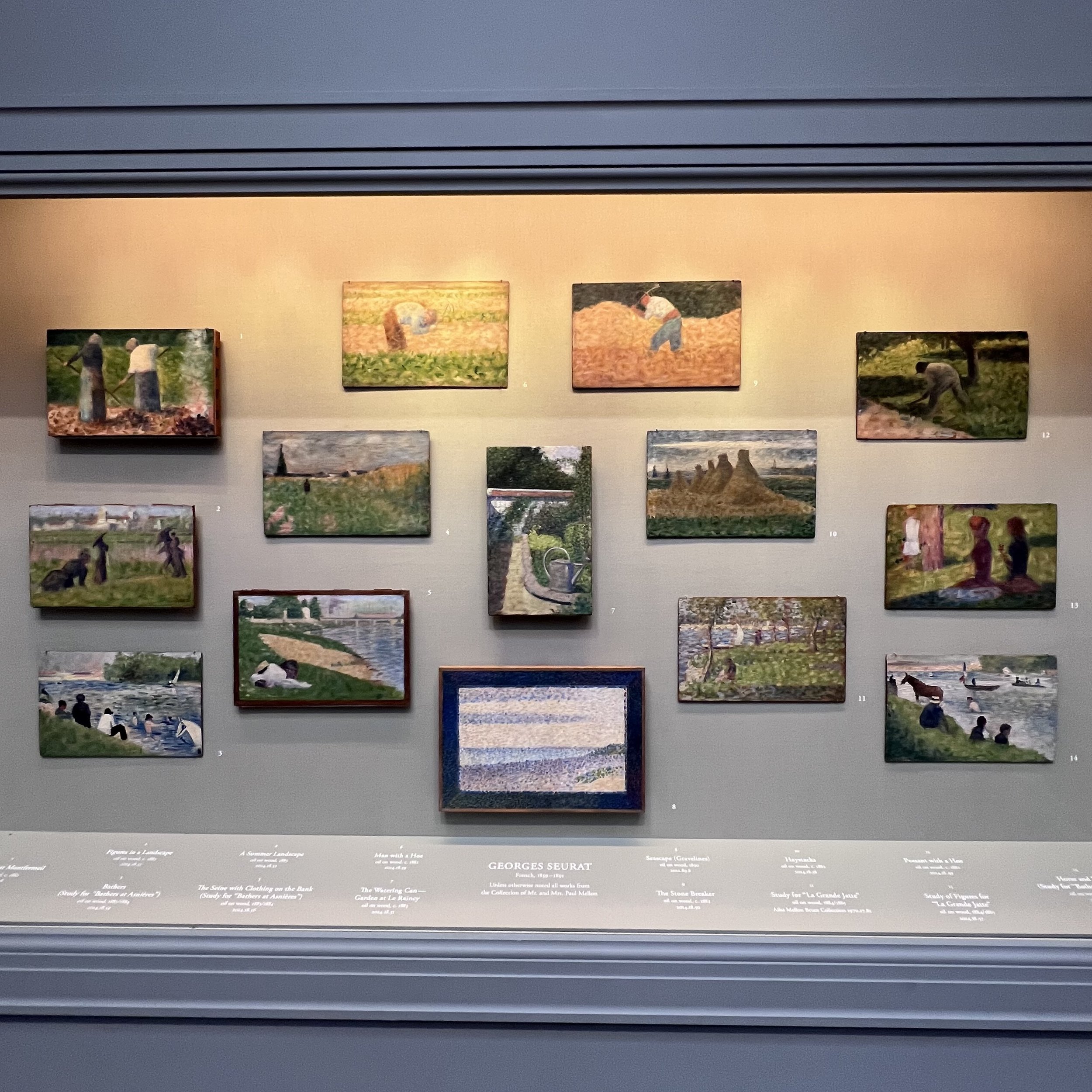
The National Gallery of Art in Washington DC has an engaging display of small panels by Georges Seurat.
Photographed by Michael Rose, summer of 2023.

In the nineteenth century, forms of art-making shifted and became more democratized. New technologies allowed for the manufacture of novel artistic materials and artists broke out of their studios to paint en plein air. Confined by what they could carry and by what would remain stable on an easel outdoors, canvas sizes were often reduced and small panels were fodder for sketches that were as masterful and boundary-breaking as the finished works that succeeded them.

At the National Gallery in Washington DC, a case filled with panels featuring studies by the French Post-Impressionist painter Georges Seurat reads like the wall of a contemporary small works show. The wood panels in the series measure at an average of ten inches or less on their long side but are filled with the same enticing Pointillist sensibility as Seurat’s completed paintings like his famed A Sunday Afternoon on the Island of the Grand Jatte. Together, the collection illustrates the artist’s working process and the ways in which large and complex compositions could be developed in smaller bites across multiple panels.

Image of Dororhy and Herbert Vogel alongside work from their growing collection of small art in the 1960’s.
Image by Bernard Gotfryd via Wikipedia images.

Modernity has not ebbed the love for small art. The extraordinary story of collectors Herb and Dorothy Vogel is evidence of this. Throughout the mid and late twentieth century the Vogels became important collectors of some of the most significant artists of their time. Although both had blue collar jobs, they were able to amass an important collection by focusing on small works by big names including the likes of Lynda Benglis, Lois Dodd, Sol Lewitt, Robert Mangold, and Elizabeth Murray. Their sizable holdings eventually took over their modest apartment in New York and they became the subject of a PBS documentary. Much of their remarkable collection was then distributed to museums in all fifty states, making for an enormous impact in small doses.

Whether it be a devotional ivory, a tiny portrait, a nineteenth century painting, or a work of breathtaking modernism, smaller works of art have always appealed to collectors. Today, in an age of the big, the bold, and the expensive, small works exhibitions provide an outlet for artists to create work they are passionate about in a format that is often more accessible to collectors in terms of both the wall space and money required to add such a work to their holdings.

As the season of small works sales gets underway, individuals hoping to support artists in their communities might consider the proud history of collecting modest works as inspiration to buy wonderful little artworks for their own collections.

Review: Impressionism Explored at Worcester Art Museum

Impressionism remains one of the most revered movements in Western art history. The soft focus paintings of Monet continue to hold sway with contemporary audiences sheerly through their unbridled beauty. The divergent influences and aftereffects of the Impressionist movement are less well-known by audiences but are no less worthy of exploration. In a current exhibition at the Worcester Art Museum, some of the complex realities of this art historical moment are explored, resulting in new insights that go beyond a popular aesthetic.

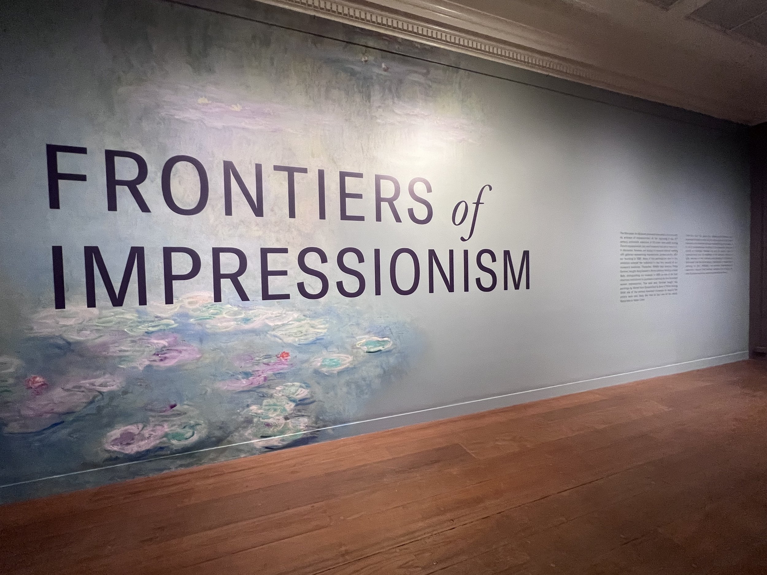
The entrance to the exhibition is a wall-spanning tribute to the Worcester Art Museum’s prized Monet Waterlilies.

Fronters of Impressionism, curated by Claire C. Whitner and Erin Corrales-Diaz, aims to unpack the nuances of artmaking in the late nineteenth and early twentieth centuries. On view through June 25, the show probes the world as it was when Impressionism arrived and shares works produced by concurrently occurring artistic movements. The narrative the exhibition unfolds will give many museum visitors their first broad readings of a period that is often characterized in the popular imagination as being dominated by the likes of Renoir or Cassatt.

The exhibition of course has fine examples of European paintings like Claude Monet’s 1908 Waterlilies, which was purchased by WAM within just a couple years of its creation. This is the kind of image that springs to mind when the term Impressionism is raised. But alongside Monet, the exhibition also contextualizes movements like the Barbizon School or later Pointellist creations and does an excellent job of illustrating how artists outside of Europe digested and influenced the avant-garde ideas of the Impressionist vanguard.

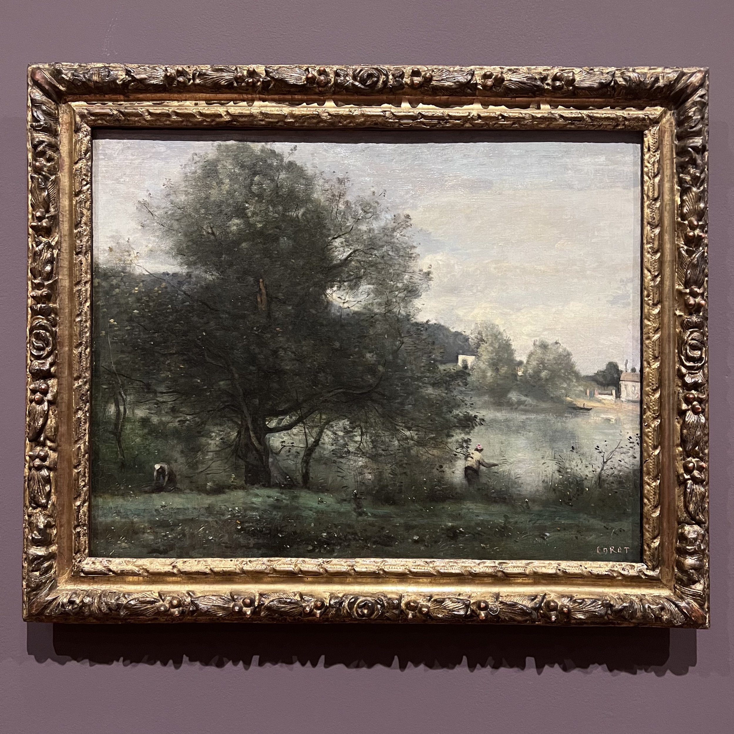
Corot’s A Fisherman on the Banks of the Pond, created between 1865-70, is a prototypical Barbzon artwork, and the type that would inspire generations of American landscape painters.

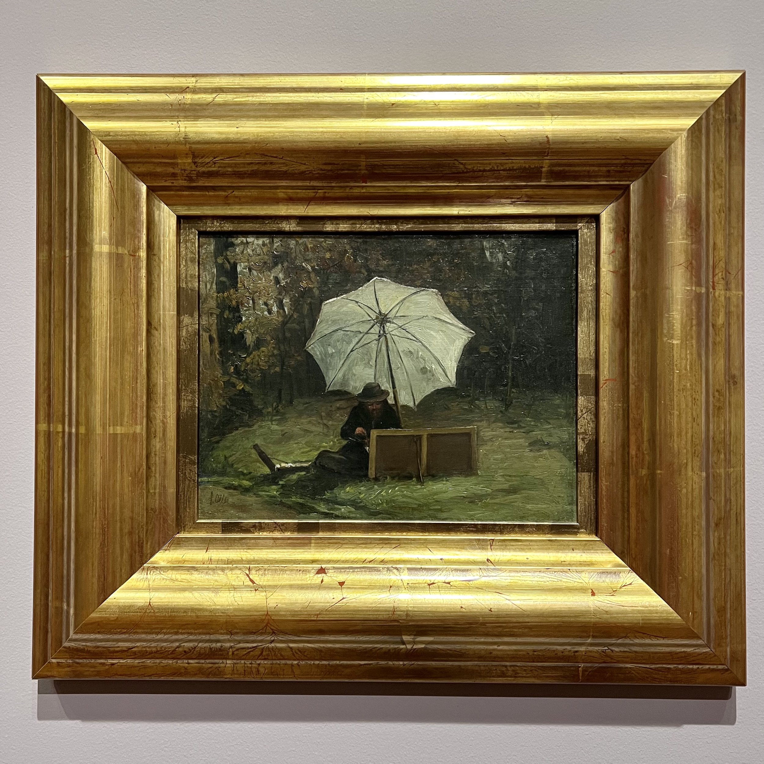
Works by Puerto Rican artist Francisco Oller y Cestero (1833-1917) are featured in the exhibition, highlighting an artist who was intimately involved in the zeitgeist of the turn of the century and who had friendships with peers like Pissarro. In a small painting from 1864, Oller y Cestero captures his friend Paul Cézanne painting out of doors, documenting one of the more important strategies of boundary-breaking artists in the nineteenth century. Where the powerful French Academy of Fine Arts demanded that polished artworks be produced in the studio, young artists rejected this and painted “finished” works en plein air, giving life to a tradition that continues today.

Both a product and document of the Impressionism moment, Francisco Oller y Cestero’s painting of his friend Cézanne depicts the technique behind the avant-garde plein air painters.

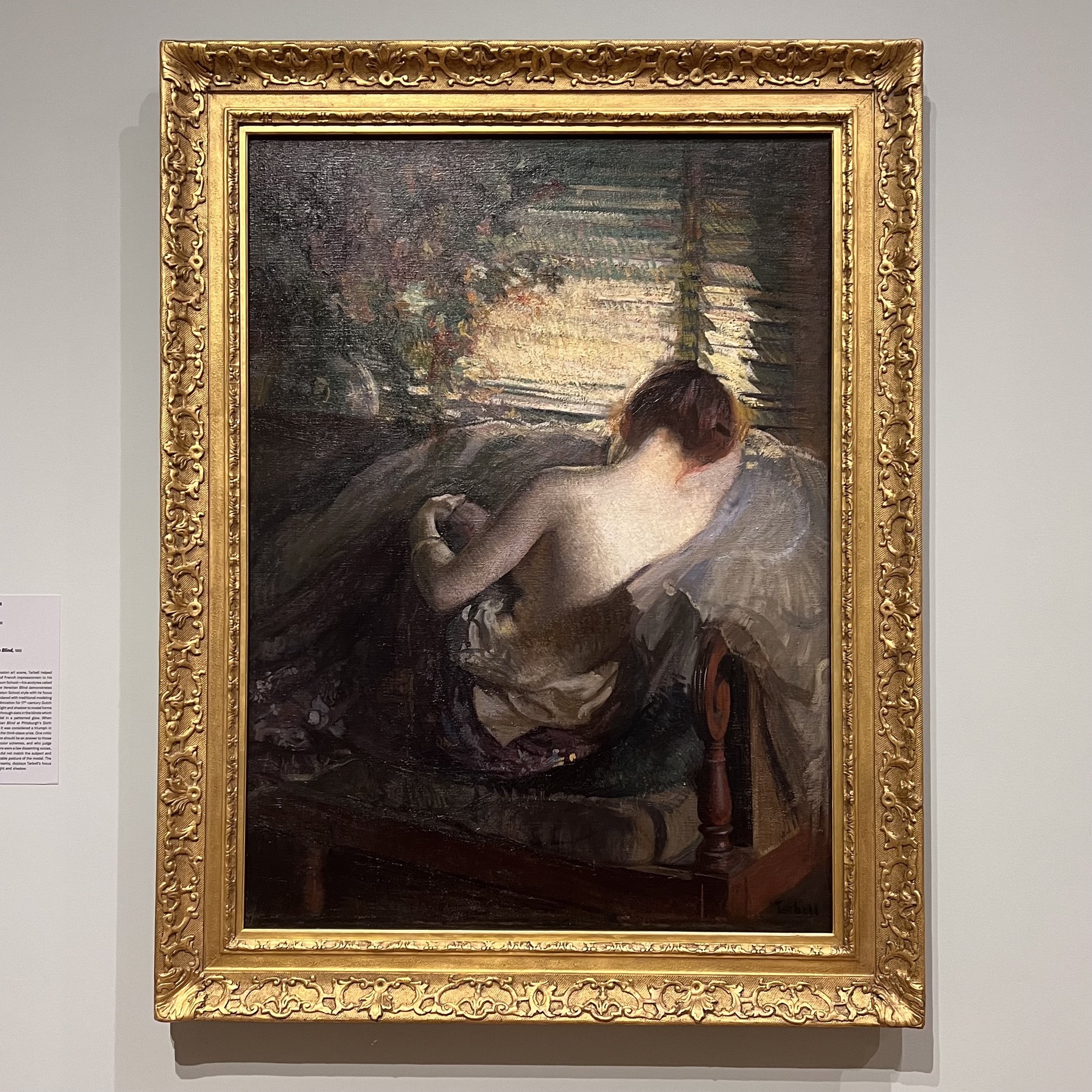
Artists of the United States also make up a sizable component of the show. A fine example by landscapist Edward Mitchell Bannister is shown alongside portraits by John Singer Sargent and Cecilia Beaux. One of the best paintings in the show is by fellow American Edmund Charles Tarbell (1862-1938). Titled The Venetian Blind and produced in 1898, the painting was another early acquisition by WAM and has been owned by the museum since 1904. A award-winning work in its day, Tarbell’s figure is bathed in diffused golden light and interior elements like the titular shades bear his distinctive and painterly hand. It is at once a romantic and modern image, hinting at European precedents while tackling a contemporary subject in a novel way.

One of the exhibitions most interesting pieces, Edmund Tarbell’s The Venetian Blind, produced in 1898, presages the type of figurative artwork that has only recently returned to vogue in the twenty-first century.

Through the show, viewers will be able to follow the influences of Impressionism through to their various conclusions. The reality is that the ways in which these intrepid artists shaped the works made by ensuing generations are hard to define. But Frontiers of Impressionism provides a great sampler, and in doing so promises to encourage visitors to find new connections between individual artists, discrete schools, and varying periods.

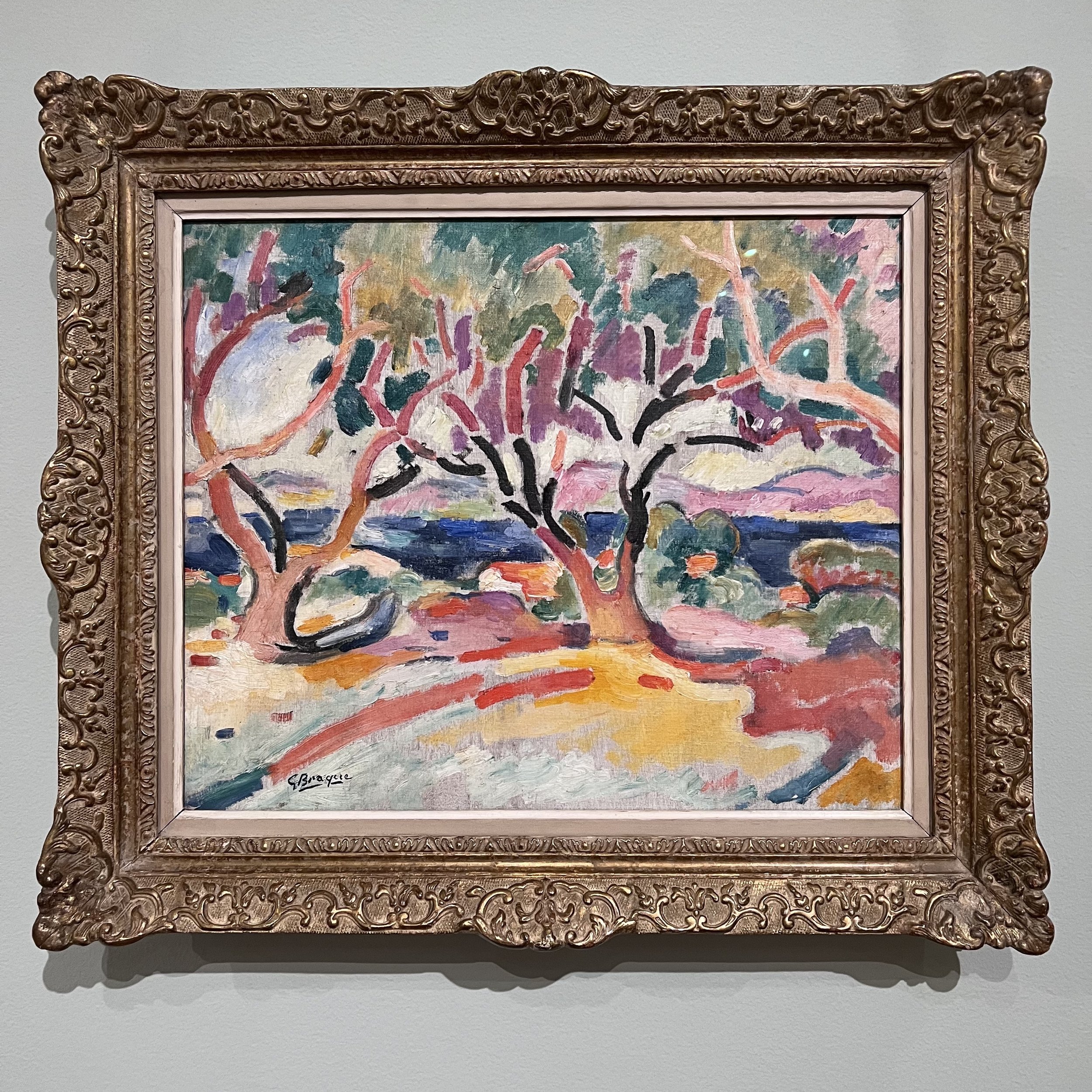
Towards the end of the exhibition, some of the more radical offspring of the changing art world are shown. A vivid and lush Paul Signac painting from 1896 shows off a technicolor Pointellist technique. Capturing the Golfe Juan in the South of France, the image of a pink horizon over the seaside is scintillating and celebratory. Nearby, Georges Braque’s Olive Trees from 1907 tackles another landscape subject with similar zeal. While Signac’s coastal scene is a coalescence of painted dots, Braque’s tree is a disintegration of limbs executed in utterly unnatural tones. Looking at it, the thrilling modernisms of the twentieth century that owe so much to their nineteenth century predecessors can be seen and felt in the distance.

Georges Bracque’s 1907 Olive Trees heralds the excitement of forthcoming modernisms that would define art in the twentieth century.

Frontiers of Impressionism is on view now through June 25, 2023 at the Worcester Art Museum. After the exhibition concludes in Worcester it will travel to the Tampa Museum of Art, the Tokyo Museum of Art, and other venues. Learn more about the exhibition and plan your visit while it is on view in New England at www.worcesterart.org.

Mabel Dwight's American Scene

Looking back at American art in the twentieth century, some of the most valuable visual resources are those produced by printmakers. From the urban explorations of John Sloan or Edward Hopper to the more nuanced and human-focused prints of artists like Elizabeth Catlett or Sister Corita Kent, printmaking experienced something of a long golden age. Mabel Dwight is a seminal figure of the American printmaking scene, and an artist whose works are full of trenchant observations of American life. In looking at just four examples of her work, one can find insights into Dwight’s perceptive views of her time and place through the eyes of an artist.

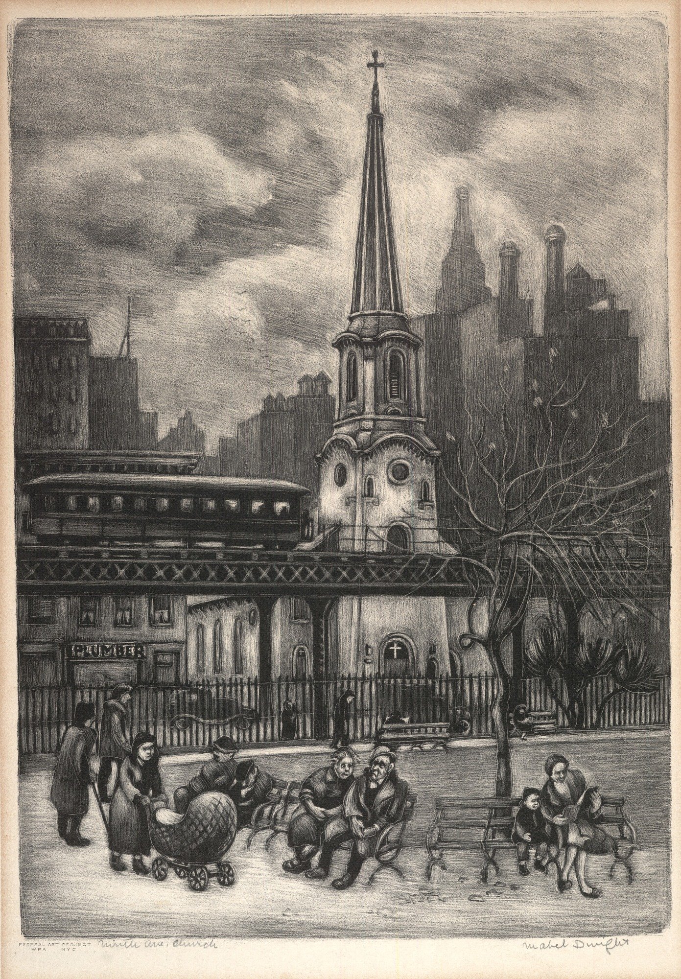
In a 1936 lithograph, titled Ninth Avenue Church, Dwight’s wry sense of humor is on display. A white church stands in the middle of the frame, with the rising city behind and a park in the foreground. What might be a bucolic scene of a New England town common is disrupted by an elevated rail line that brings a train car rattling across the center of the image, obliterating the view of the church’s charming steeple. One imagines what the scene looked like before progress brought train tracks. The image has an auditory quality too. The church bells chiming, the murmurous chatter of park goers, and the clatter that fills any urban space. Other works throughout Dwight’s production lean heavier into the funny. Quotidien images of nuns in libraries or fish in aquariums or audiences in movie theatres are transformed into delightful narrative forays.

Mabel Dwight, Ninth Ave. Church, 1936, lithograph on paper mounted on paperboard, Smithsonian American Art Museum, Transfer from the Evander Childs High School, Bronx, New York through the General Services Administration, 1975.83.46

Dwight’s sensibility for people is another through line in her prints. In her Summer Evening, a lithograph from around 1945, a group of figures gather on a street corner lit by a singular streetlamp. The light source dangles to the side of a tilting telephone pole whose wires bleed into the dark skyscape. Under the glare below, men sit on a stoop and characters chat, presumably in the cool air of early night. The image picks up on a tradition of narrative evident in other prints, perhaps most famously in Edward Hopper or Martin Lewis. Where Lewis or Hopper may have shown the scene from above, Dwight brings the viewer eye to eye with the people on the ground. For her the corner represents a nexus of community life and conversation and connectedness. Many of her artworks are ultimately about people and the lives they lead.

Mabel Dwight, Summer Evening, ca. 1945, lithograph on paper, Smithsonian American Art Museum, Bequest of Frank McClure, 1979.98.74

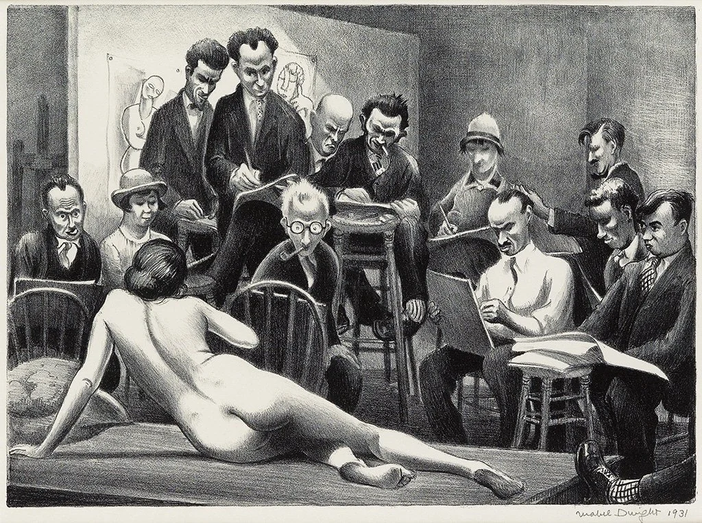
As much as examinations of the American scene or Americans themselves, though, Dwight was also an extremely active artist who ran in the bohemian circles shaping the nation’s art during an exciting time. In a number of images throughout her oeuvre she examines what it means to be an artist. In her Life Class, from 1931, she shows a group of students at the Whitney Studio Club drawing from a nude model. While any art student will recognize the context of the image, Dwight also captures an art historical moment. Edward Hopper and other luminaries, which Dwight counted among her peers, are present. The image is about the art of making art and it makes one want to pick up a pad and pencil.

Mabel Dwight, Life Class, lithograph, 1931, via Swann Auction Galleries

One of Dwight’s most poignant images turns from the busy excitement of a group life class to the more solitudinous feeling of the studio. Executed in the same year as Life Class, Dwight’s Night Work probes the more solitary aspects of the art practice. Possibly a Greenwich Village scene, the image captures a sort of rear window view through the grand open windows of a neighboring studio across the way. As the hazy moon shines through the clouds above, a lamp illuminates the artist’s drawing board. The scene tells both the story of bustling urban life in the early decades of the century, but also frames the artist’s experience as one that is fundamentally a lone journey in making things.

Mabel Dwight, Night Work, lithograph, 1931, via Swann Auction Galleries

Mabel Dwight’s work is well respected in print circles and held in numerous collections including those of the Smithsonian, the Whitney Museum of American Art, the Museum of Modern Art, the Metropolitan Museum of Art, and others. Her prints also appear regularly at the market and at a variety of price points. Looking at just these few examples of her work, one can appreciate Dwight’s remarkable eye and her singular contributions to the epic world of printmaking in the United States of the last century.

Seurat’s Circus and the Spectacle of Pointillism 

Nineteenth century France was a time and place full of excitement around new modes of art making. Of the avant garde schools that took shape in this moment, the Impressionists are the best known and most widely revered. Defined by Monet’s sensuous treatment of subjects ranging from cathedrals to haystacks, the appeal of the Impressionists is hard to escape. Other contemporary movements, such as the Pointillists, sought to broker new ways of seeing as well, and with dazzling effects. Georges Seurat’s Circus Sideshow is a signature product of the thrilling nineteenth century and shows off the spectacle inherent in the Pointillist mode.

The Pointillists, led in large part by Seurat, aimed to dissolve the picture plane into innumerable inflections of paint. The eyes of viewers would reassemble these dots, completing the intended image in the heads of onlookers. Based on a novel and sophisticated understanding of optics, the works produced by the Pointillists have a scintillating quality that is unlike the works produced by their earlier counterparts. While Monet’s paintings might make one marvel at light or atmosphere, Seurat’s hinge on something more complex. They make the viewer consider how a picture is constructed, diffused, received, and absorbed.

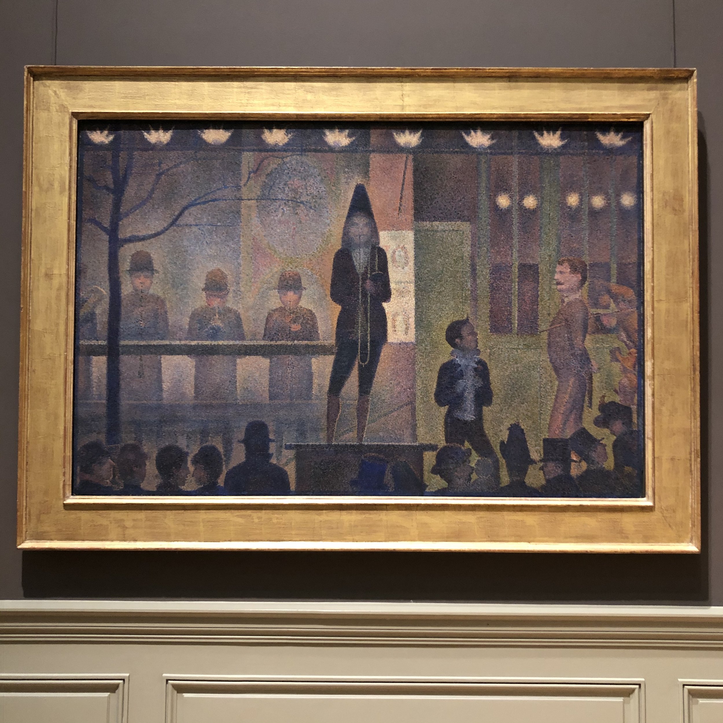
Seurat’s Circus Sideshow, now in the collection of the Metropolitan Museum, leverages the stylistic flourishes of Pointillism to underscore the showmanship of its subject. Musicians are seen playing under gaslight and over the heads of a crowd eagerly hoping to gain admittance to a circus proper. The hum of the gathered group seems implicit in the daubs of paint spread across the surface of Seurat’s canvas. It is a painting about the buzz of a public event, and that exciting atmosphere is perfectly attuned to Seurat’s technique. Each dot of paint can be read as a warbling note of sound, or as the glint of twilight, or as a dash of the vibration of the rowdy mob.

Georges Seurat, Circus Sideshow (Parade du Cirque), 1887-1887, on view at The Metropolitan Museum of Art

The image was exhibited at the Salon des Indépendants in 1888. In displaying this vivid nocturne, Seurat was playing a bit of a game with his audience. Like a circus, French salons of all types were about showmanship. Paintings were designed to stop the crowd, to draw them in, to rile them up. Seurat’s image is no different. Its stylistic treatment, novel when it was painted, is still surprising and exciting today. Looking at the painting, one gains a sense of atmospheric dramatism that surpasses many comparable works of the Impressionists. Seurat’s Pointillists sought to build upon the groundbreaking works of the likes of Monet, whose famed Impression Sunrise was completed sixteen years prior to Seurat’s engaging Sideshow.

The event at the heart of Seurat’s grand painting was a proceeding designed to entice passersby to become customers. Through showmanship, this tertiary scene was supposed to turn viewers into ticket-buyers and bring them under the big tent. It was about allure. In this way, the sideshow and Pointillism overlap. They are both full of eye-catching spectacle.

Pointillism was designed to catch, and hold, and entrance the eye. The effect remains and even today Pointillist works bring the viewer back again and again.

Seurat’s interest in circus imagery was deep and the motif appears a number of times throughout his oeuvre. The Met’s Circus Sideshow is one of his largest and most stunning artworks and one that easily defines the movement. It, like the evening it depicts, is a grandiose and exciting extravaganza.

By looking at Circus Sideshow, viewers become both onlookers of art and participants in a public spectacle. They might be dazzled by Seurat’s composition, or by his palette, or by the Pointillist technique. They also become the crowd, like the one the artist captured, waiting in line for a chance to get a closer look at the show.

A detail from Seurat’s Circus Sideshow

In New Bedford, a Rare and Wonderful Exhibition of Albert Pinkham Ryder

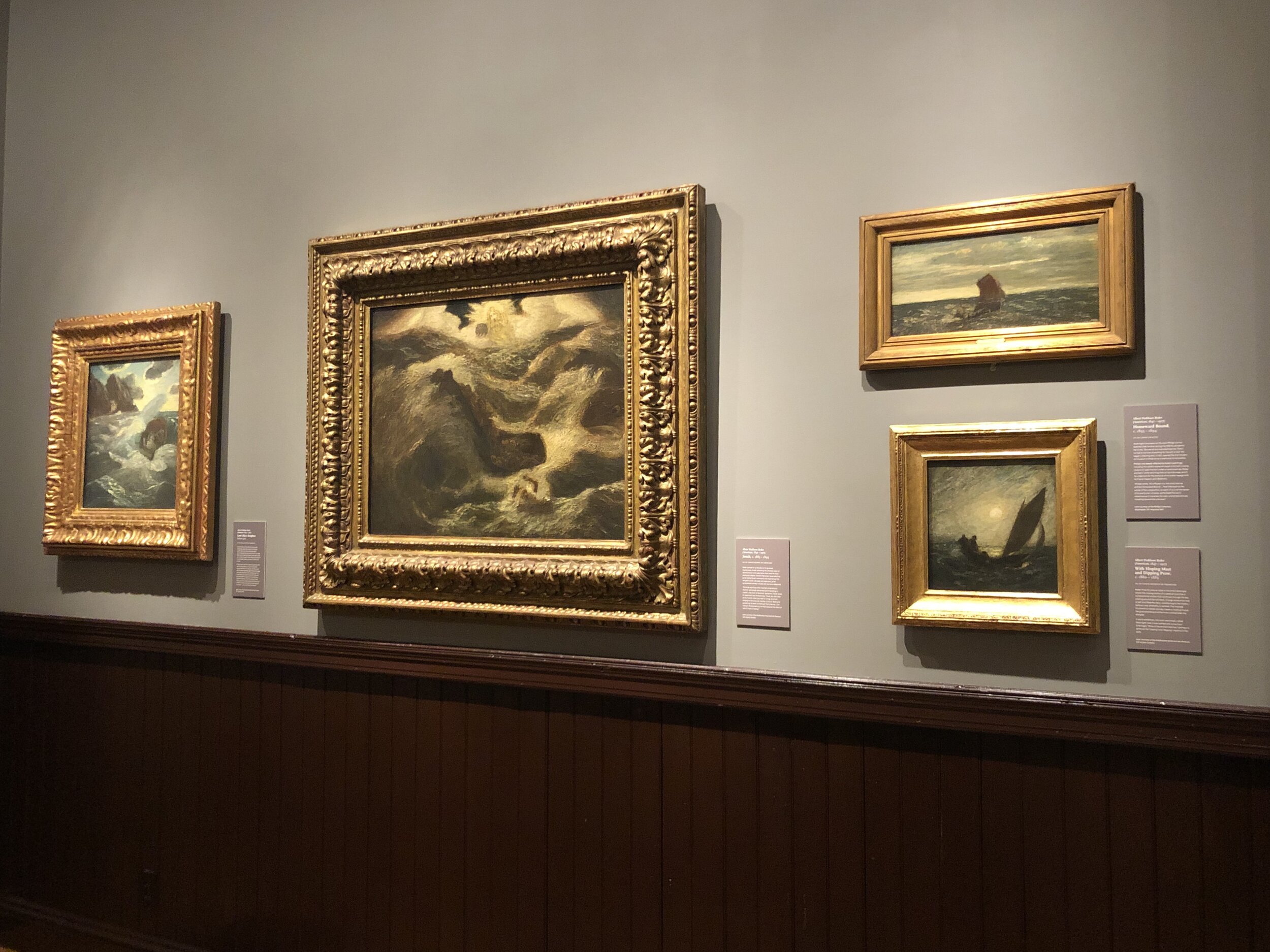
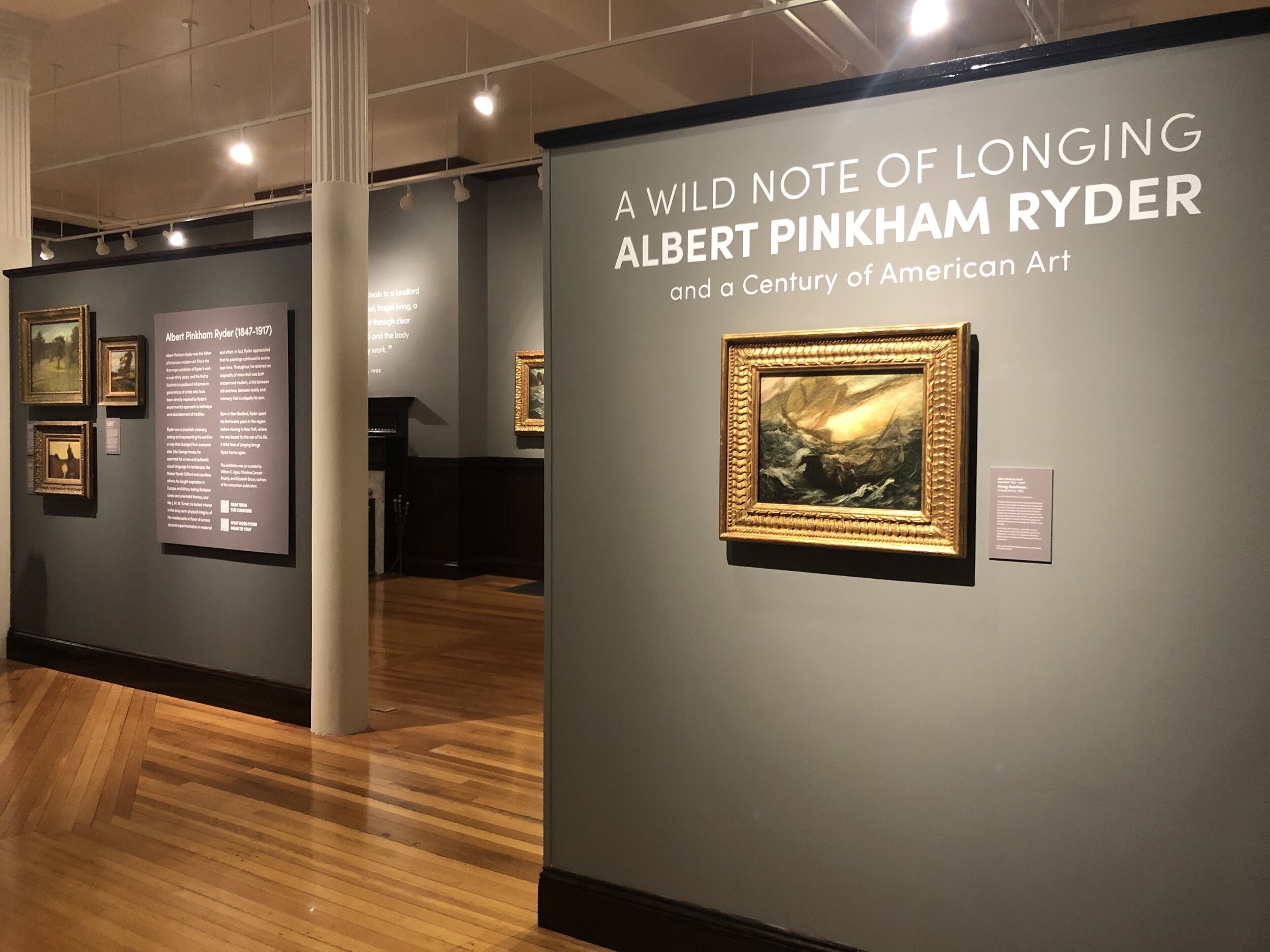
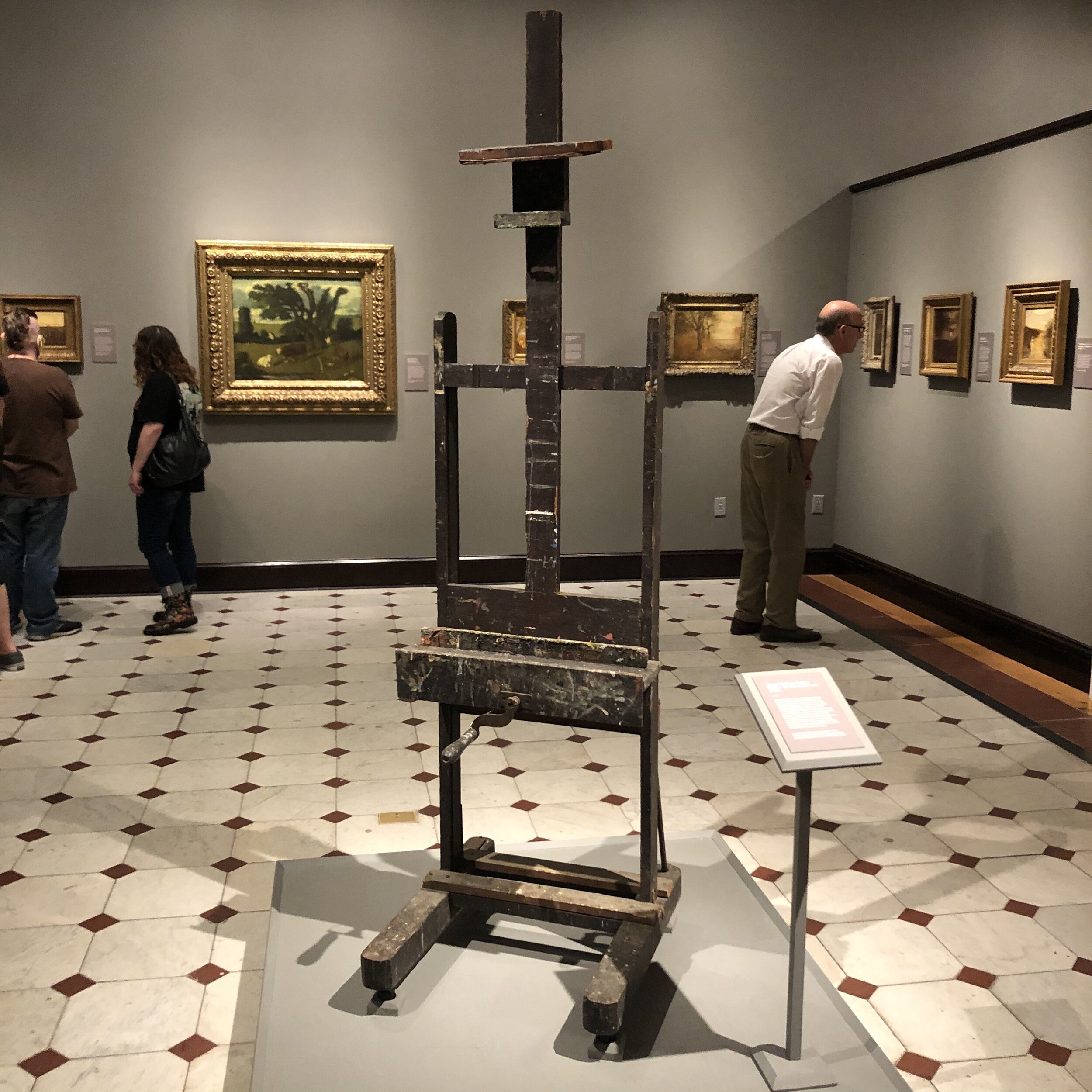
Albert Pinkham Ryder (1847 - 1917), may not be a household name but his contributions to American art are significant. An exhibition on view through October in the artist’s birthplace of New Bedford, Massachusetts, explores his art in its own right as well as within the context of modernist movements that came in his wake. Mounted by the New Bedford Whaling Museum, the show is a rare and wonderful opportunity to see many of Ryder’s paintings in one place. A Wild Note of Longing: Albert Pinkham Ryder and a Century of American Art is a must-see exhibition which will reshape perceptions of American art history.

One of the most exciting elements of the show is that it gathers together many of the artist’s paintings in one exhibition. This is the first significant display of Ryder’s work since a 1990 retrospective at the Smithsonian Museum of American Art. Some of the paintings on view are indeed on loan from the same institution and give viewers the opportunity to explore works that they might otherwise have to travel to Washington, D.C. to experience. Other artworks come from major institutions like the Metropolitan Museum, the Brooklyn Museum, and the Phillips Collection, making this a mini-blockbuster exhibition.

A quote from Ryder illustrates his independent sensibilities alongside his paintings.

A quote from Ryder illustrates his independent sensibilities alongside his paintings.

Seeing Ryder’s work in his hometown rather than in New York or the nation’s capital is part of the thrill of this show. Not far from the Whaling Museum’s galleries, the sights and sounds of this historic maritime city are reminders of some of Ryder’s inspirations. Bells are heard from nearby trawlers and seagulls fly low overhead. New Bedford’s bustling port is one of the busiest and most lucrative in the country. In Ryder’s day it was a similarly busy place and the realities of seafaring play into the aesthetic and philosophy of his art.

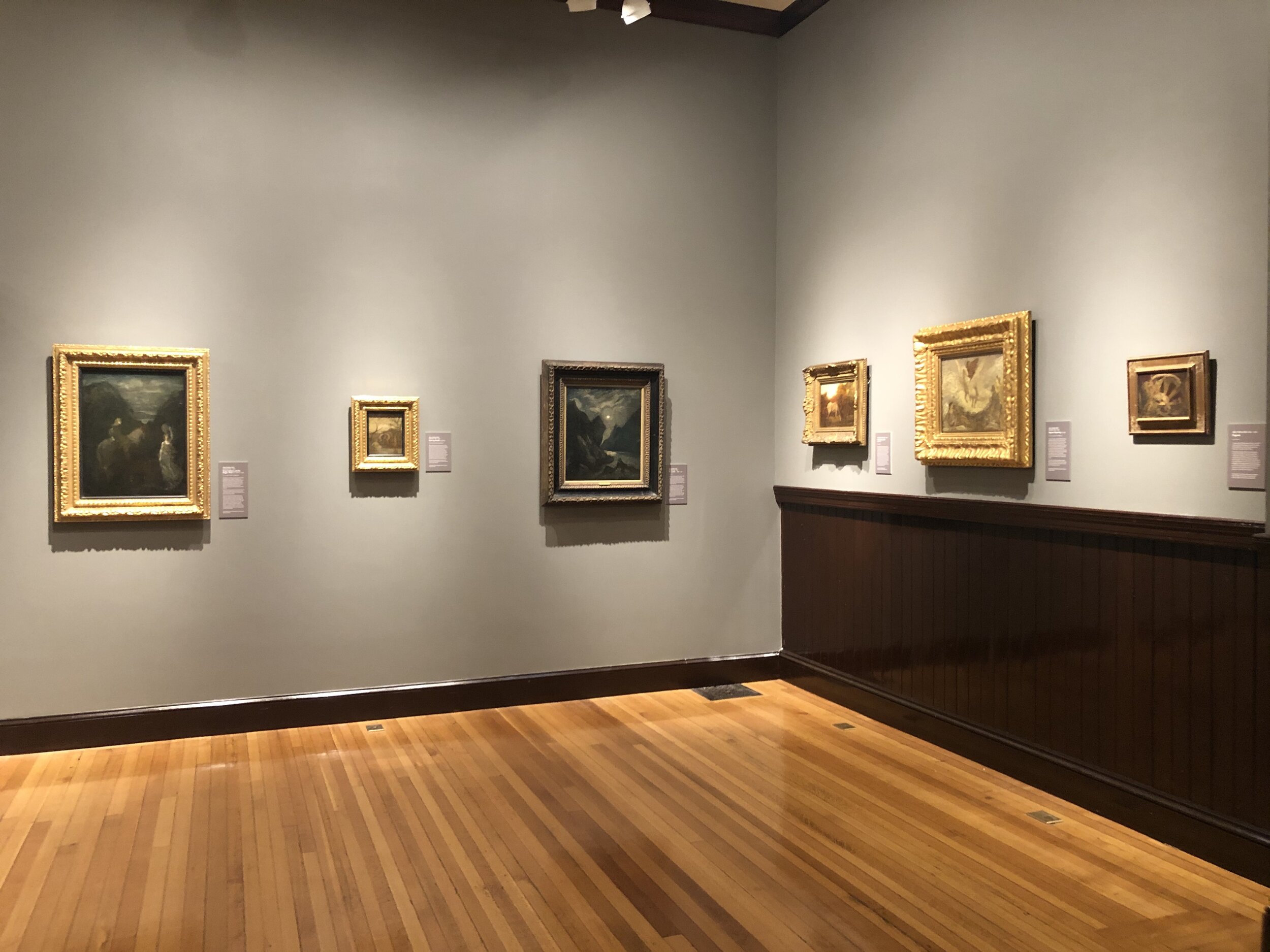
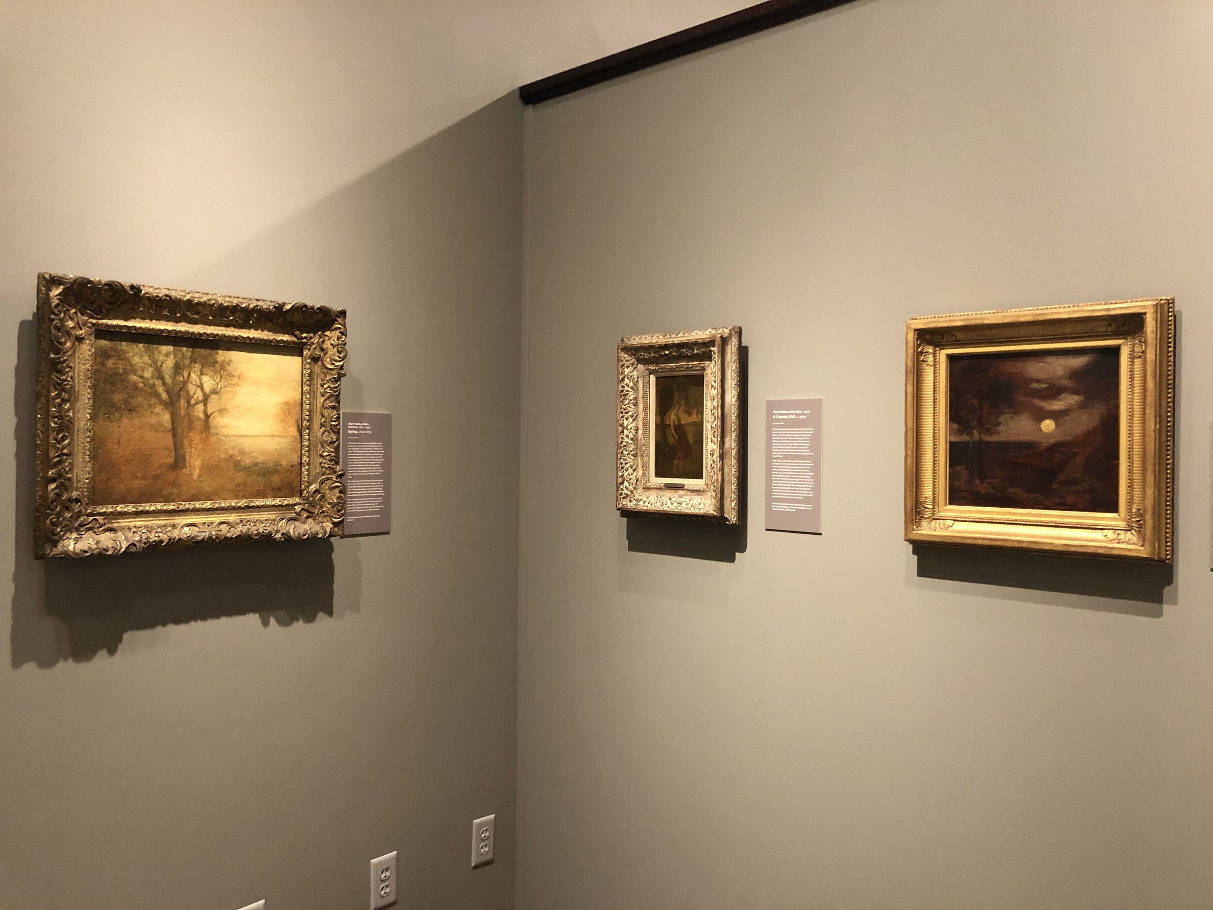
Ryder’s work is not easily classified but many of his treatments of land and sea bear markings most readily associated with the Tonalist school which heavily influenced American art in the late nineteenth century. Inspired by European counterparts, such artists often sought to create poetic and romantic imagery defined by particularly moody palettes. Where Ryder’s work often differs from his contemporaries is in brushwork, composition, and the sheer expressive energy of his scenes. Ryder’s paintings give viewers a sense of the raw power of the sea, the glittering beauty of atmosphere, and the possibilities of historical or mythological narratives. 

A painting by Wolf Kahn (1927 - 2020) forms an interesting contrast to an earlier piece by Ryder.

A painting by Wolf Kahn (1927 - 2020) forms an interesting contrast to an earlier piece by Ryder.

The exhibition does not feature Ryder alone, though. The show pairs a wonderful range of the title artist’s paintings with works by later makers who similarly broke boundaries and reconsidered the potential of expression. Works by artists such as Jackson Pollock, Marsden Hartley, Wolf Kahn, and Richard Pousette-Dart form a fascinating pendant to the excellent selection of paintings on view by Ryder.

While Ryder was born in New Bedford, he spent a good portion of his adult life in New York before returning to his hometown at the time of his death. He was an unusual and often lone individual who cuts something of a melancholic figure. While his painterly contributions may not be fully appreciated by a broad audience, this exhibition is an important step in bringing viewers a more complete picture of American art. Ryder’s paintings are beautiful and mournful and provoke emotional reactions as well as appreciation for his remarkable handling of paint. He is, in short, one of the great American artists of any generation and this exhibition is a fantastic chance to learn more about him and his incredible impact.

A Wild Note of Longing: Albert Pinkham Ryder and a Century of American Art is on view at the New Bedford Whaling Museum through October 31, 2021. For full details and information on planning your visit, go to www.whalingmuseum.org.

An Artful Perch Remade at the Providence Athenaeum

The nineteenth century in America was a notable boom time for the visual arts in the United States. Between the end of the American Civil War and 1900, many of the nation’s most notable arts institutions were founded, including Yale’s School of Art, the Metropolitan Museum, the Art Institute of Chicago, and the Pennsylvania Academy, to name a few. Americans were, more or less en masse, taking hold of their own cultural aspirations. They developed their own schools in which to study art and museums in which to showcase their growing collections. In Providence, Rhode Island, the arty excitement of the moment was borne out too. In 1877 the Rhode Island School of Design was founded, in 1880 the Providence Art Club followed, and in the mid 1890s the established Providence Athenaeum added a new space dedicated to the visual arts. Recently, the Athenaeum’s Art Room was remade in glorious style. The result is a delightfully artful enclave within a bookworm’s paradise.

The Athenaeum is one of the region’s cultural gems. Founded in 1836, it draws on a heritage of book lovers that can be traced as far back as 1753 when one of its predecessor organizations, The Providence Library Company, was established. A members’ lending library with a populist appeal, the Athenaeum is housed in a stoic temple designed by William Strickland and sited gracefully on the brow of College Hill. The building, which has the look of an ancient vault of knowledge, was opened in 1838. A stone's throw from Brown University and RISD, the Athenaeum is not only the reserve of bibliophiles, but counts among its membership and its wider fanbase people of diverse backgrounds. These days it isn’t uncommon to find an Instagram influencer making a pitstop in the library’s hallowed carrels.

The stately facade of the Athenaeum on a late spring afternoon. A banner with the Rhode Island state motto “Hope” is strung between the doric columns that flank the main entry.

The stately facade of the Athenaeum on a late spring afternoon. A banner with the Rhode Island state motto “Hope” is strung between the doric columns that flank the main entry.

Recently, Athenaeum Director of Collections and Library services Kate Wodehouse generously offered to host me for a visit to the library’s refurbished Art Room. On a bright afternoon I made the five minute walk from my office at the Providence Art Club to our neighboring organization to take Kate up on her collegial hospitality. Located on Benefit Street, itself lined with an unparalleled collection of homes dating to the eighteenth century, the Athenaeum’s crisp and stoney grey facade is set off against the verdant foliage of late spring in New England. Upon my arrival Kate quickly whisked me through the library’s warren of stacks to the uppermost room of the building. Ushered through an unassuming door, one finds a glimpse of the enthusiasm for art that abounded just prior to the turn of the century.

Created in 1896, the Art Room was to be both a place of studious solitude, as well as a latter day cabinet of curiosities. It is tucked away just behind the revival pediment of the Athenaeum’s facade and is accessed from the library’s distinctive and cozy mezzanines. At the entrance one is greeted by a bust of the Providence-born art critic Albert J. Jones, who famously left the bequest that resulted in the foundation of the neighboring RISD Museum. This was to be another hallmark moment in the advancement of art in the city during the period. Just outside the entry to the Art Room the careful observer will also find a fantastic diminutive nocturne of the Athenaeum painted by printmaker Eliza Gardiner hung discreetly under a sconce.

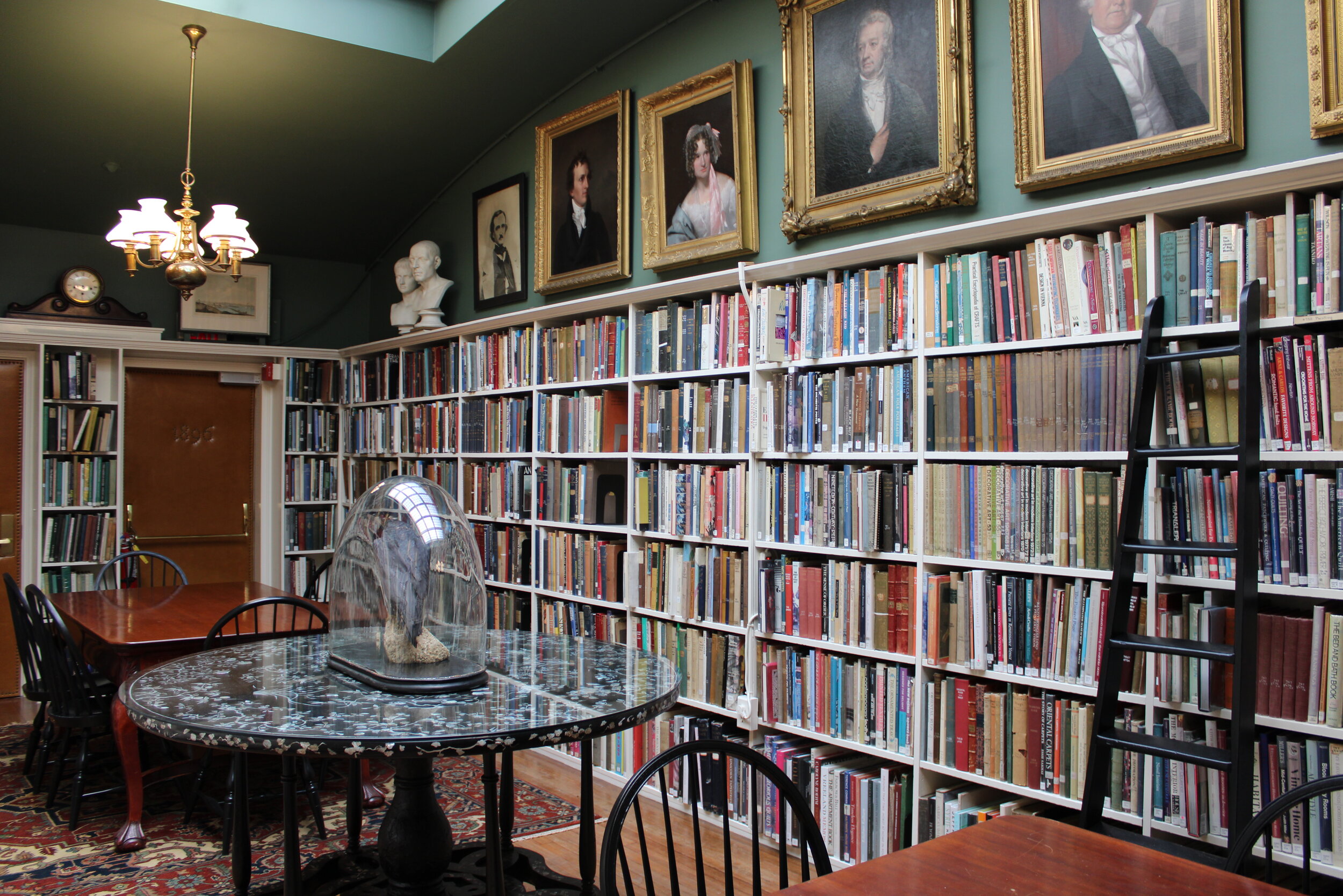
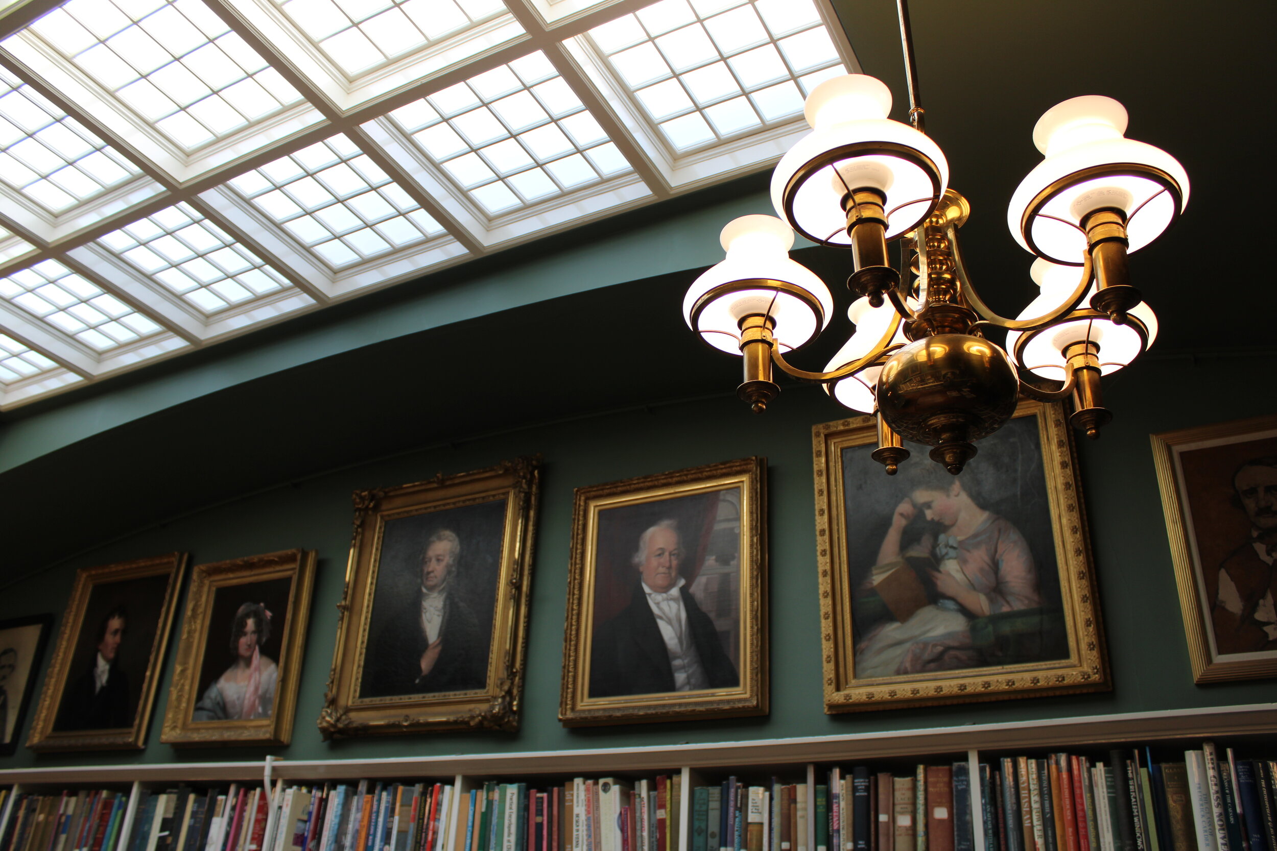
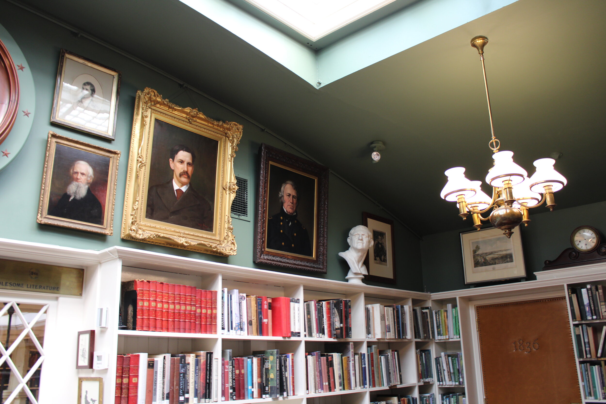
Entering the Art Room from this curated landing, one finds a space that has received a top-to-bottom restoration. Refreshed in new tones, a lush green canopy of a ceiling overhangs the space, where paintings and busts from the Athenaeum’s collection are displayed together in artful repose. Here, portraits of the likes of Edgar Allan Poe surmount shelves filled with texts on art of all kinds. A window in the space looks out on the library’s photogenic main hall. It is both a suitable backdrop for cultured contemplation as well as a fitting vantage point for people-watching. The window’s inviting seat is newly bedecked in a William Morris textile, a pattern popular among Arts and Crafts devotees who were also experiencing an expansion in their ranks around the time the space was devised.

The Athenaeum’s refurbished Art Room sports freshly repainted surfaces and newly reinstalled art.

The Athenaeum’s refurbished Art Room sports freshly repainted surfaces and newly reinstalled art.

Within this context, one is immediately impressed by the density of the installation. Although wall space is at a premium in this bookcase-lined room, there is ample art on view. Primarily a collection of portraiture, the result is a feeling of accompaniment in the pursuit of knowledge.

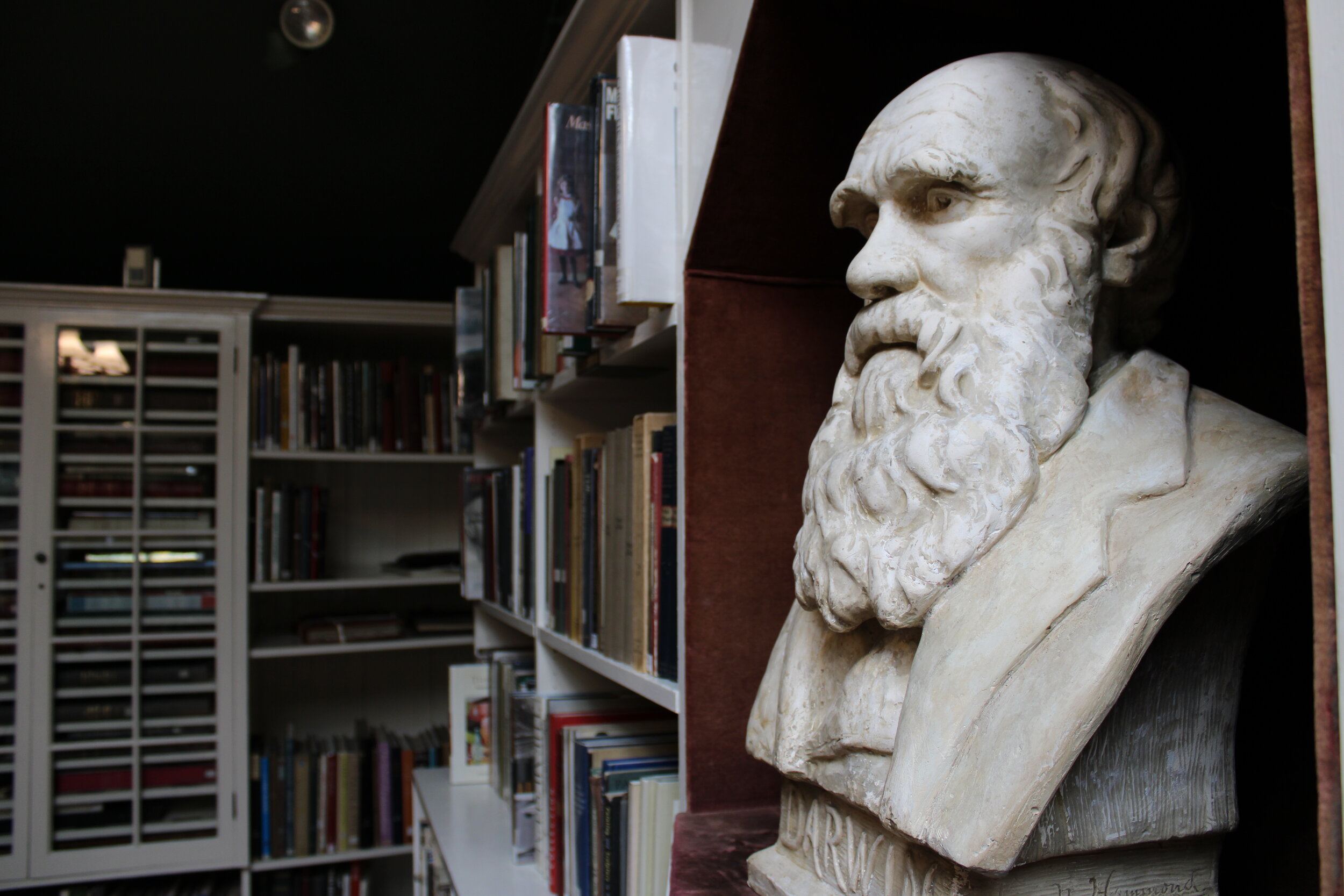
In the center of the ceiling, a generous skylight has also been glitteringly refurbished. It fills the room with natural light, which falls glintingly on the glass-topped stuffed raven that holds court at the center of a Chinese-export inlay table. Nearby, a bust of Charles Darwin by nineteenth century sculptor Jane Nye Hammond stares out unflinchingly. Pendant tables at either end of the room are now encircled with elegant black chairs designed by the local firm O&G Studio in a style appropriate for an institution of this period. Each has a brass plaque with the name of a donor who commissioned it for the purpose of this restoration.

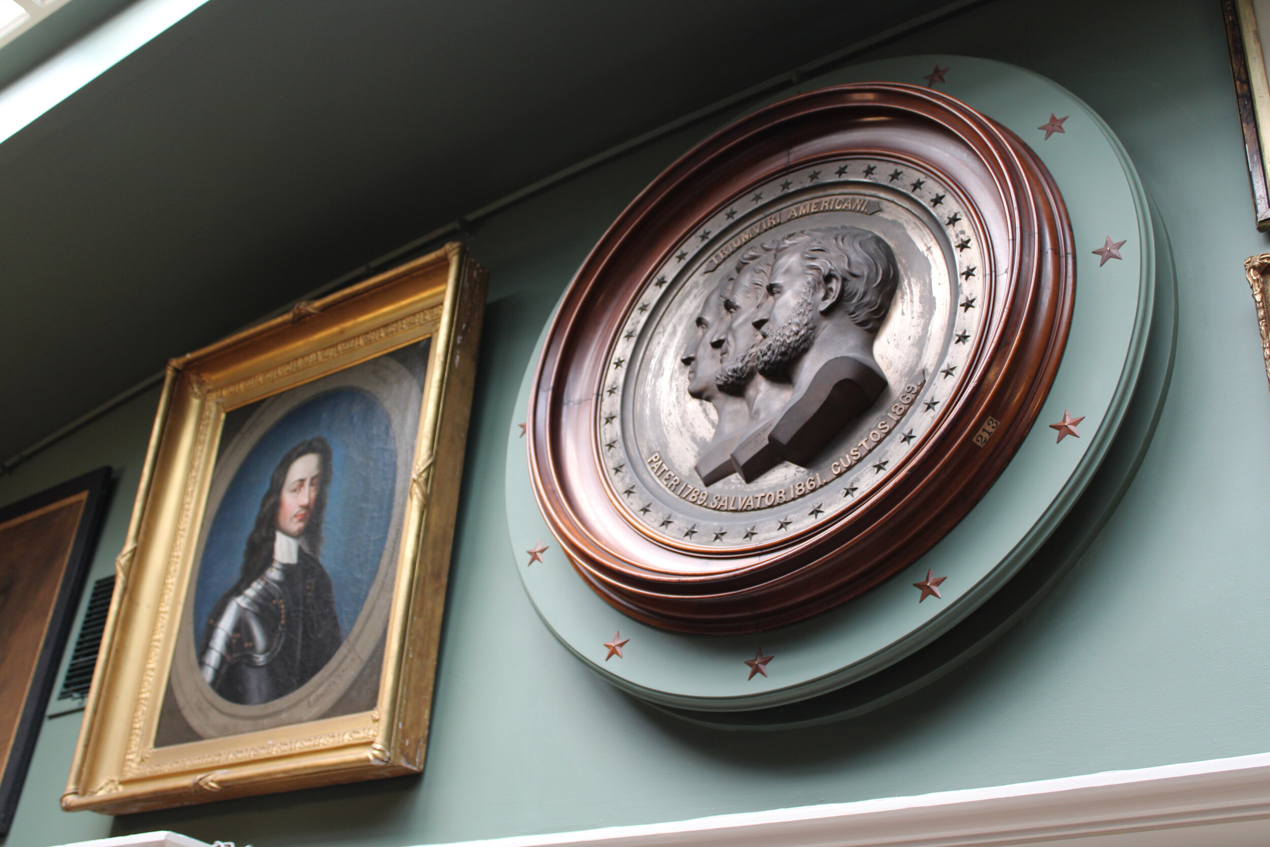
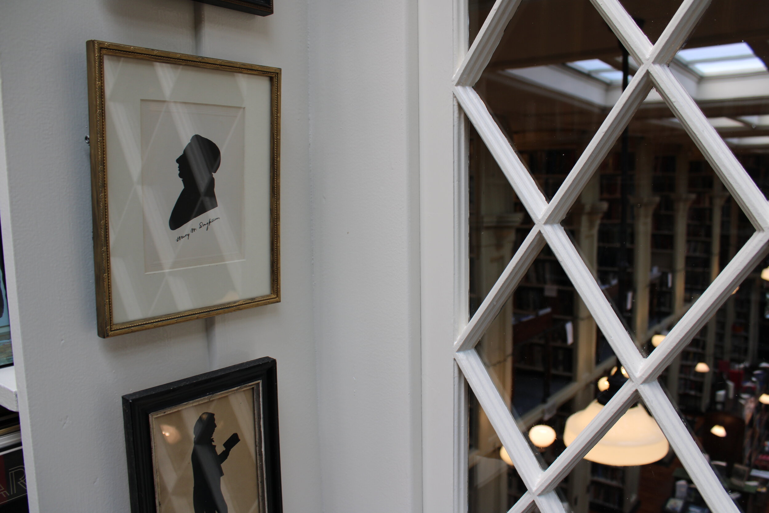
Other details include an expertly conserved portrait by Hugo Breul, tiny silhouettes of reading characters, and an enormous patriotic bronze relief installed creatively to hide a meddlesome air vent.

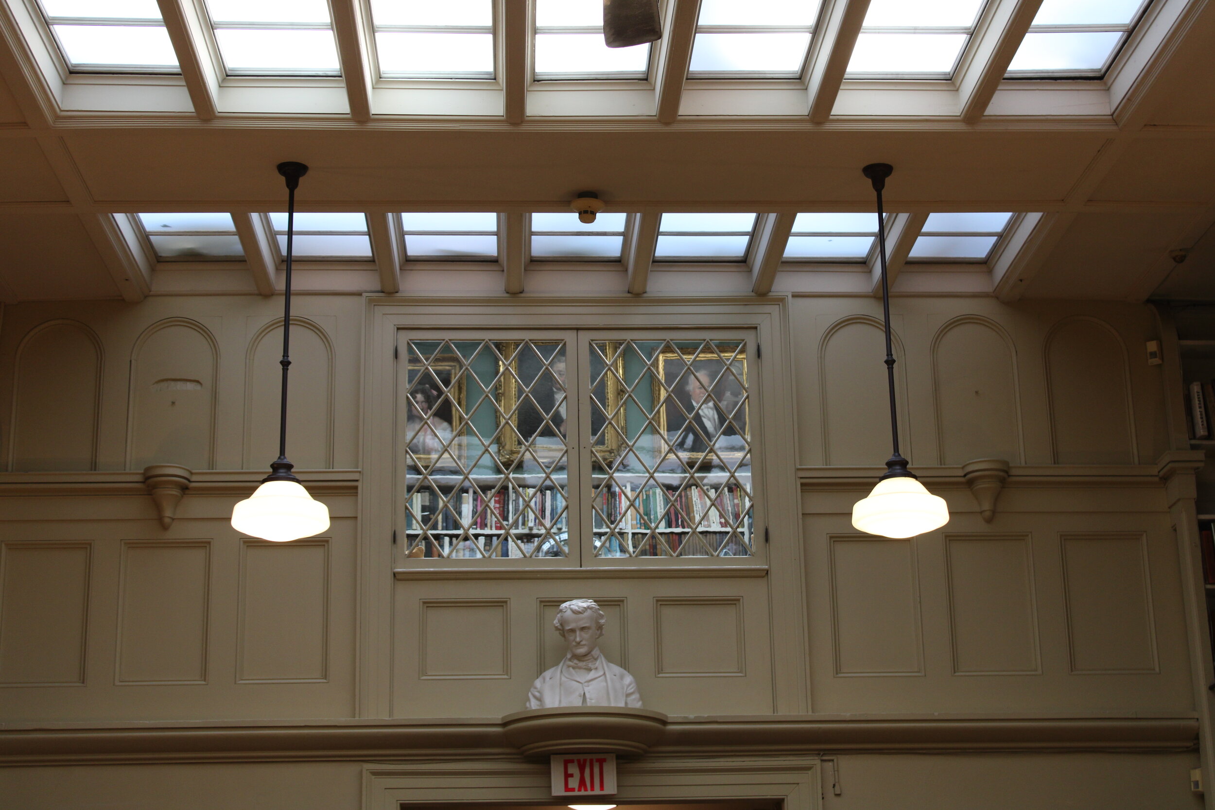
A window in the Art Room looks out on the main hall of the historic library. It is topped by a bronze frieze installed during the restoration.

A window in the Art Room looks out on the main hall of the historic library. It is topped by a bronze frieze installed during the restoration.

Even after an all-too-brief visit, the Athenaeum’s Art Room is already one of my new favorite places in town. To those who were already well-acquainted with it, seeing the remodel is akin to reuniting with an old friend who looks better than ever. The whole assemblage is not only a beautiful and thoughtful restoration, but a tribute to the spirit of the library’s community throughout the years and an exploration of a zest for art that dates to the 1890’s.

Much of the handiwork involved in making this revised Art Room a reality was that of Tripp Evans, a passionate member and volunteer. When he is not busy painting woodwork and reinstalling art, he also teaches art history as a professor at Wheaton College. The work he, and other volunteers, and Athenaeum staff like Kate have done is a continuation of the labor of many art lovers through history.

To step into the Art Room is to step back in time and to be in the blossoming art world of the late nineteenth century. I found myself at one point saying to my host that I myself wish art people today might take the same sort of bohemian glee in creating an environment as our counterparts did over a century ago. Far from being stuffy or staid or polite, the American cultural scene of this time was an exciting and even boisterous one. Rooms like the one recently restored at the Athenaeum were not just venues for quiet reading, but for serious and spirited debates about the visual arts in America.

It would be appropriate then, if this renovation sparks the kind of excitement that it merits and helps those who enter the Athenaeum’s Art Room to reimagine and interrogate art’s histories and its futures.

Under the glow of brass light fixtures and the Art Room’s skylight, portraits peer out over art books.

Under the glow of brass light fixtures and the Art Room’s skylight, portraits peer out over art books.

As much as it was an exciting place when the Art Room was added in 1896, The Athenaeum is also one today. In the last decade or so it has undergone, to use a much overused word, something of a renaissance. Always a great institution, it has recently become a decidedly hip one. It has mounted exciting public programs, refreshed its digital presence, and even restored the long dormant fountain which stands in front of its main entrance on stately Benefit Street. The renovation of the Art Room is just another feather in the cap, and a crowning one, which celebrates the unique and timeless spirit associated with this great landmark.

As my visit to the wonderfully inspiring Art Room came to a close I headed back out into the main body of the library. When exiting the space, one passes through a door newly clad in supple caramel leather. Tacks in the center of the door spell out “1836”, the year of the institution’s founding. Exiting onto the snug landing outside, one is faced with the latin phrase Ars Longa, Vita Brevis freshly stenciled in gilded letters on the green wall. To one side, the bust of Albert J. Jones stands sentry next to a vintage photograph of the Roman ruins that inspired him.

The quotation above the steps, which was added to the space during the successful remodel, rings true from antiquity to today. It means Art is Long, Life is Brief.

Below, enjoy a gallery of photographs below that I took on my recent visit to the Athenaeum’s Art Room. Thanks again to my colleague Kate Wodehouse for her gracious hospitality. As of this writing, the Athenaeum is open only to their members due to current restrictions. Visit providenceathenaeum.org for more information.

How Looking at a Lost Rembrandt Can Help Us See

In the early 2000’s the British singer Kate Nash had a song which began “Simply knowing you exist ain’t good enough for me.” The same can be said for art. It simply is not enough to know an artwork is out there somewhere. Art must be seen close up to be fully appreciated. In a world sodden with digital media, the quest to view art in person is a virtue, but developing virtual connoisseurship skills is a necessity and learning to love art we have not yet seen is  something to aspire to. In the new Netflix series This Is a Robbery, the infamous theft of artworks at the Isabella Stewart Gardner Museum highlights one painting in particular that is easy to love without seeing. Considering this lost object, we might learn something about how to look at art anew. 

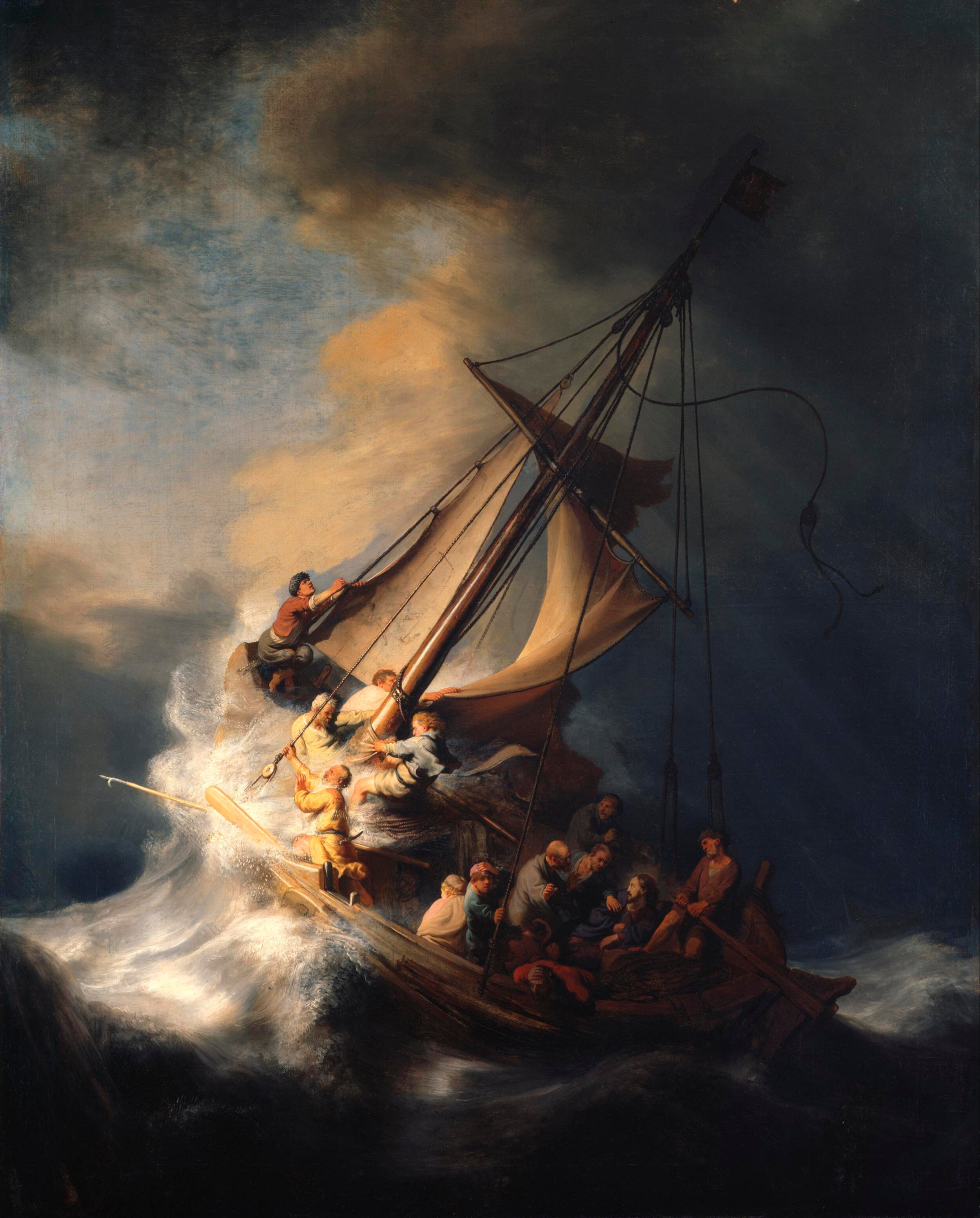
Rembrandt van Rijn’s 1633 painting Christ in the Storm on the Sea of Galilee was one of the dozen plus artworks stolen from the Gardner in the notorious 1990 heist. If you are interested in the investigation surrounding this event, Netflix’s new This is a Robbery does an excellent job of outlining key facts, identifying the potential thieves, and detailing the crime with the storytelling of a police procedural. While tempting, it is difficult to highlight any of the stolen artworks as the most important of the lot because they were all significant for different reasons. Of all the missing works, though, Rembrandt’s seascape is in many ways the most beguiling.

Rembrandt Harmens van Rijn, Christ in The Storm on the Sea of Galilee, 1633, Isabella Stewart Gardner Museum

Rembrandt Harmens van Rijn, Christ in The Storm on the Sea of Galilee, 1633, Isabella Stewart Gardner Museum

Although we cannot view the painting now, as it disappeared three decades ago, it is easy to see its intrinsic qualities. Though in all likelihood Rembrandt’s depiction of Christ is moldering away in some mafia don’s basement, it is possible to know and to love, even in absentia. Moreover, the strategy in developing an eye for such absent artwork is transferable. As contemporary viewers, we are increasingly faced with digital versions of plastic arts that remain effectively unseen to us. Training the skills of looking is a necessary practice and by looking closely at this missing Rembrandt through archival photographs it is possible to relearn how to look at all art in the virtual world. 

In the Gardner painting, a swelling wave raises up to heave a small vessel filled with Jesus Christ and his tempest-tossed followers. The result is an angular composition which naturally draws our eye across the scene in an exciting way. We are invited to peer into the boat as terror sweeps through the crew of Apostles. In the snapshot the painting captures, Christ is caught in the moment of being awakened. This prompts him to question the faith of his followers. It is the apex of the drama. In the ensuing moments, Christ quells the sea and saves his friends. It is a well-known parable, so the imagery is itself a reminder of the importance of faith rather than a narrative cliffhanger. A devout Christian viewer of this picture would know that all ends well in this stormy sea and would read it as an admonishment to trust in God. 

Other elements of the canvas go beyond the illustrative or theological and towards the sensory. We can feel the salt spray splashing across the creaking deck. We can hear the wet slap of the flailing sails against the mast, which glistens in a shaft of light that breaks through the bleak all-encompassing sky. The howling wind is so real that it chills our bones in the same way it impacts the Church Fathers, who run too and fro in futile attempts to secure the vessel or can be seen to kneel in prayer for salvation.

So, through the image we do have of the painting, taken before its hasty departure from the Gardner, we can learn the basics of its composition and the elements of its value. But how can we deepen that knowledge and how can we enrich our appreciation for this lost masterpiece?

Looking at the many other extant paintings by the Dutch master, one can develop a sense for his technical bravura, including his handling of paint. Without seeing this specific painting, one can imagine the thick impasto of the northern Baroque and the richly painted seascape veiled with tones of brown and gold. With this information in hand, we as viewers can easily imagine the textures of this lost painting and find an appreciation for a great work of art in spite of the fact that many of us were not able to see it before it was yanked from its frame. 

Looking at Rembrandt’s numerous examples of self-portraiture, one can also find the face of the artist in this scene. The artist is depicted as the lone character to stare directly out into our space, to encounter us, and to invite us into the action with his gaze. Through looking at other Rembrandts we can learn the language of his pudgy and expressive face and recognize it again here. He becomes a stabilizing influence, an old friend in a lost ship. 

Detail in which Rembrandt’s self-portrait appears at left, bookend by Christ. In between the two an Apostle heaves overboard while another kneels to pray for the storm to cease.

Detail in which Rembrandt’s self-portrait appears at left, bookend by Christ. In between the two an Apostle heaves overboard while another kneels to pray for the storm to cease.

Through an appreciation for Rembrandt’s larger body of work, too, we might realize that the topic is unusual. We may recognize Rembrandt as a painter of portraiture or history or religious subjects, but we would not be able to put our finger on another instance of him painting a seascape like this one because this was his only such painting. Maybe it is this realization that would crystallize the grief one might encounter when considering the long ago robbery of this painting. Whether it is in a warehouse in the outer boroughs of New York or in a garden shed in Connecticut is irrelevant, because it is now lost to us and to history. The pain of this reality is visceral.

Rembrandt’s Galilean sea looks like a gorgeous and remarkable painting. If it were still in its gold frame in the sumptuous Dutch Room at the Gardner Christ in the Storm on the Sea of Galilee would undoubtedly be one of the best regarded paintings in America. This attribution would not just be because of its rarity, or technical brilliance, or even for its dramatic narrative. If this painting was still on view, it would be loved within and because of the wider context of Rembrandt’s meaty production.

By reconsidering this lost painting, unseen to us now and probably forever, we might find a new appreciation for Rembrandt’s oeuvre and may too find the tools we need to consider other kinds of art. This is not to say that a contemporary painting that lives in a museum hours away is as lost to us as the Rembrandtian fishing boat, but that the skills needed to hewn a sense for one are also key to the other. To know a lost painting like the Gardner’s Rembrandt, one must train their eye and use that knowledge. To get to know art in a digital space without seeing it in real life in a gallery or studio, one must do the same. 

To know that Rembrandt’s painting is out there somewhere is certainly not enough for any of us who love art and who long to see it close up. We would all love to see it again under the glare of gallery lights. After watching This Is a Robbery, we might all pine to go back in time and take one last look at its craquleured surface before the infamous night that two faux policemen strode into Isabella’s museum. To look closely and see the placid face of Christ or the knowing glint in the eye of Rembrandt himself would be a pleasure and a delight.

In the meantime though, it is worthwhile to try and love Rembrant’s picture in the passionate, imperfect way that we can. Through a few digital photos on our screens we can imagine and reimagine a great painting and find a new way of looking at art.

Looking at Morisot and Renoir’s Women

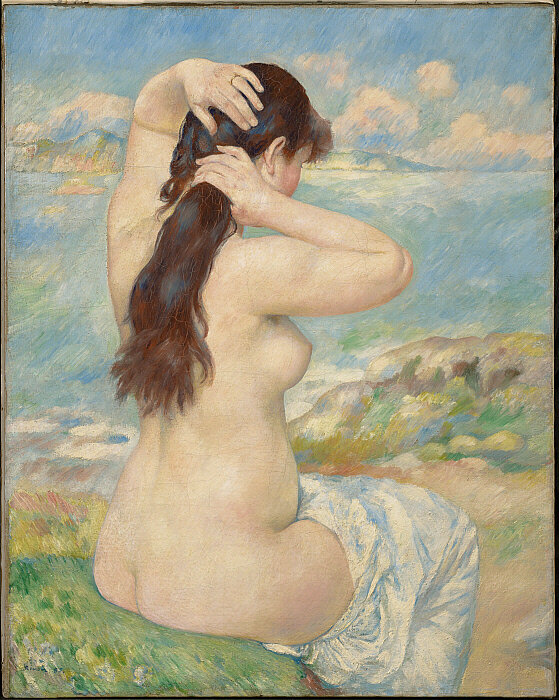
It is important to know art in its context. That is to say, to fully appreciate a work of art, it helps to see artworks of the same moment - to view another vision from the same time. In the case of a pair of paintings made by two different artists in the same year, in the same country, now held in the collection of the same museum, we can find divergent visions of women in the last quarter of the nineteenth century. Pierre-Auguste Renoir’s Bather Arranging Her Hair and Berthe Morisot’s The Bath were both products of the same revolutionary moment, both were painted in 1885, and both now reside not far from one another at The Clark Art Institute in Western Massachusetts. But for all they have in common, they share two opposing views of women as subject that couldn’t be more different.

Pierre-Auguste Renoir, Bather Arranging Her Hair, 1885, Oil on canvas. The Clark Art Institute, 1955.589.

Pierre-Auguste Renoir, Bather Arranging Her Hair, 1885, Oil on canvas. The Clark Art Institute, 1955.589.

Renoir’s painting, like so much of his work, is as dully anesthetic and as psychically alleviating now as it was when it was made. An art to be a balm from the hustle and bustle. It is something pretty to look at, and with its cotton candy tonality and its imagined and idealized beauty, it gets the job done.

Renoir depicts an unknown woman, a purposefully unidentified individual, in nature. He draws on the trope of the bath in the woods that occurs so much throughout Western art that by the time he hit upon it, it would have been clichéd. Renoir’s lady looks away from us and toward an incongruous sea that itself melds with puffy clouds far away. She is dividing her ample and shiny brown hair into two parts. Her chemise falls away to reveal the curvaceous silhouette of her nude body: a breast, a belly, a buttock, a thigh. But Renoir’s is an unreal and sensualized figure. A body in space, surely, but a body nonetheless. To classify this painting as a masterclass in the Impressionist vision of landscape is to deny the fact that there’s a woman sitting in the middle of it. A woman with no identity, and no clothes.

A product of, and leader in, the Impressionist moment which would prove one of the agitating seedbeds of Modernism, Renoir is also a character whose own reputation is constantly being re-examined. Of the first generation of Impressionist painters, he is today one of the most, and perhaps most surprisingly, controversial. The #RenoirSucksatPainting movement, for instance, winkingly asks museums to “end the treacle”.

In spite of his Impressionist bona fides, Renoir’s nudes could almost be Rococco. They are unreal to the point of surreal, and sickeningly sweet. The kind of art that makes the rattle of the guillotine sound like a reasonable solution to political differences.

When looking at them and taking them at face value it is indeed often hard to tell if Renoir himself was in on the joke, or if he was making the type of paintings the market wanted, or if he genuinely believed they were any good.

Berthe Morisot (French, 1841–1895), The Bath, 1885–86. Oil on canvas, 36 1/4 x 28 7/8 in. Clark Art Institute, Williamstown, MA, 1955.926

Berthe Morisot (French, 1841–1895), The Bath, 1885–86. Oil on canvas, 36 1/4 x 28 7/8 in. Clark Art Institute, Williamstown, MA, 1955.926

In Morisot’s image of the same subject, the figure comes inside and puts her clothes on. We see a clearly bourgeois woman in a defined domestic space: France in 1885, a woman getting ready for the day. Morisot’s subject is an upwardly mobile denizen of the new middle class of the nineteenth century; both urban and urbane.

She looks out at us piercingly and unwaveringly while arranging her own hair not dissimilarly to her counterpart in Renoir’s picture. Her chemise is firmly on, however, while a brush sits in her lap and a ribbon rounds her neck. A gold bracelet and a wedding ring glitter on her delicate wrist and finger. Her clothing hides her body. She is a woman with both identity and agency. A thoroughly modern woman - at odds with Renoir’s mythological forest lady.

It is also noteworthy that Morisot’s painterly treatment of her own scene dovetails nicely with the technical elements of Renoir’s painting. These were, after all, two artists of a similar ilk, working within the same milieu. Where Renoir’s sitter is absorbed in ethereal atmosphere of light and clouds, Morisot’s is dissolved into a residential interior, with only a chair and a table to divide her from the wall. Both paintings are brashly Impressionist but their depictions of women still differ.

It is conceivable when looking at Morisot’s painting that her subject might have a life, a job, and even a purpose. She is decidedly unnymphlike and completely unsensual. She is dignified. A real woman in a real world. Renoir’s is not.

The bath as subject is an inherently voyeuristic enterprise. As the viewer of one of these paintings, we are always walking in on a woman, and typically a woman alone. We are either stumbling unwittingly, or perhaps sauntering provocatively, into a private reserve. In Renoir’s painting he allows and encourages the voyeuristic sensibilities of his audience. We become the proverbial elders to his own biblical Susanna. In Morisot’s however, the subject is aware of us and her unflinching gaze makes us aware of ourselves and of our trespass. We are seen, and the interaction is disconcerting.

Bath paintings were also often, even if subliminally, created for a male audience. Under the guise of such accepted subject matter a gentleman collector could also acquire a titillating nude. It is a kind of softcore mythology. Morisot’s painting undermines that too. Her painting defies expectations of a bath scene and could as easily be a painting for a female consumer, to whom her sitter would undoubtedly say “je suis tois”.

All of this is not to say that Renoir is somehow evil. It is not an attack on his painting(s), or, as some back door Freudian interpretation might read it, an attack on male painters more generally. To draw a comparison between these two pictures is merely to elevate our understanding of them both, and our appreciation for the societal changes occurring at breakneck speeds as the nineteenth century drew to a close.

Renoir’s nude is no doubt a product of history and of its time. But Morisot’s signals a future that she herself didn’t live to see - that of women who were not mere objects in painting, but who were makers of their own destiny. A world in which women climbed down from the pedestal in order to live in the real world. A world, for instance, in which women could vote. In Morisot’s native France, as an example, women were not enfranchised until 1944, over a century after the artist was born.

A woman in the boys club of Impressionism, Morisot was all too aware of the inequalities which faced her both within her movement and in society at large. In an incisive, telling, and heartbreaking quote from her diary, she wrote “I don’t think there has ever been a man who treated a woman as an equal, and that’s all I would have asked for – I know I am worth as much as they are.”

In The Bath Morisot turns the idea of her titular subject on its head and makes it a moment of engagement rather than of objectification. She depicts the new type of woman who populated Parisian streets as the world inched toward the turn of the century. Renoir’s Bather Arranging Her Hair, on the other hand, shows a type of female archetype who was herself already receding from art even as the paint was drying.

While Renoir’s bather looks backwards, Morisot’s looks forwards. Renoir paints an already fading history while Morisot paints a thrilling reality and a promising future. Indeed, Morisot’s bather incapsulates Modernity itself.

Looking at A Medieval Devotional Ivory

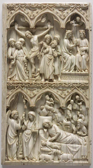
One of my favorite works of art at the RISD Museum is an object which might otherwise go unnoticed. It isn’t very large or impactful on first glance but, at about the size of a small book, it is tucked away in a corner under glass. An ivory diptych dating to around 1300, this piece depicts in exquisite detail scenes from the shared lives of Jesus Christ and his mother Mary. An exceedingly well crafted artwork, it is also one of arresting beauty. It is difficult to understand the views and opinions of those who lived hundreds of years before us, but occasionally art can make it possible. In the case of ivories like this one, we can step back in time and begin to enter the medieval mind and to experience the religious devotion that has largely come to define this period in European history.

Unknown Artist, French, Île de France, Diptych with scenes of the Nativity, the Crucifixion, and the Last Judgement, Ivory with traces of polychromy, ca. 1275–1325, each panel is 9.5” x 5.25”

Unknown Artist, French, Île de France, Diptych with scenes of the Nativity, the Crucifixion, and the Last Judgement, Ivory with traces of polychromy, ca. 1275–1325, each panel is 9.5” x 5.25”

Small ivory devotional objects in the form of miniature would-be altarpieces were extremely popular in the medieval Christian world and were produced en masse in workshops, the finest of which were located in France. These pieces, typically in diptych or triptych form, could be set up on a table within a domestic setting and then folded shut for travel. The life of the aristocratic class who could afford such an indulgence was a mobile one. Sculptural images such as this were the three dimensional equivalent of books of hours and psalters. A plethora of religious tools engaged lay Christians in a kind of prayer that matched their clerical counterparts.

Ivories would have been richly painted with polychromy, and now a few examples survive of similar works which retain their coloring. Because these objects were so purposefully tactile and because much of medieval devotion centered on the touching, caressing, and even kissing of iconic images, most extant ivories are largely denuded of color. RISD’s retains some traces, which the careful observer can find in the fine crevices of the ivory’s detailed carving.

In a contemporary world so impacted by the new norms of social distancing and in which church services for Easter weekend have largely been cancelled or moved online, the type of individual prayer common in the Middle Ages takes on a new resonance. Objects like this facilitated and were integral to the interior lives of the faithful in a time when public displays of religion were counterbalanced by rich private prayer lives in a complicated puzzle of devotion.

In RISD’s ivory, the viewer witnesses the intertwined stories of Mary and Christ, starting in the lower left register with an episode called The Annunciation in which the Angel Gabriel announces to Mary that she will bear God’s child. Mary holds a prayer book, signifying her unique faithfulness. Between her and the angelic messenger stands a vase holding a lily, a symbol of her purity as a spotless and holy virgin. In the same lower register, we can follow the continuous narrative. The figure of Mary appears again, this time laying on a cot next to the swaddled Christ child at The Nativity. She looks down adoringly at the child while above her within a cloud shepherds are told of the good news by an angel faraway. The visual constructions used in ivories followed rubrics which created images that were easily readable and readily duplicated. The result is something like a cross between a comic strip and a storyboard.

Unknown Artist, French, Île de France, Diptych with scenes of the Nativity, the Crucifixion, and the Last Judgement, Ivory with traces of polychromy, ca. 1275–1325, left panel, 9.5” x 5.25”

Unknown Artist, French, Île de France, Diptych with scenes of the Nativity, the Crucifixion, and the Last Judgement, Ivory with traces of polychromy, ca. 1275–1325, left panel, 9.5” x 5.25”

Across the central vertical hinge of the diptych the narrative continues. In the entire bottom right register, The Adoration of The Magi is depicted. At the left, a groom handles three horses entering a city gate indicating the far journey of the travelers. The three kings occupy a central space within this frame, each taking on a unique stance and presenting their individual gifts to Christ who stands precarious but confident on his mother’s knee. On the rear of the panel three oak leaves likely indicate the kingly lineage of Christ within the House of David. All medieval images, from great public works down to small personal ivories, are filled with a thickly layered language full of multivalent signs and symbols. For a medieval viewer, details that may be lost on us would have been common parlance. The three gothic arches which hover over each seen are a more clear symbol, underscoring the trinitarian nature of Christian belief.

Unknown Artist, French, Île de France, Diptych with scenes of the Nativity, the Crucifixion, and the Last Judgement, Ivory with traces of polychromy, ca. 1275–1325, right panel, 9.5” x 5.25”

Unknown Artist, French, Île de France, Diptych with scenes of the Nativity, the Crucifixion, and the Last Judgement, Ivory with traces of polychromy, ca. 1275–1325, right panel, 9.5” x 5.25”

In the upper registers of the panels, Christ’s crucifixion appears at the far left, followed by the crowning of his mother as Queen of Heaven. After the vertical hinge the story is consummated with The Last Judgement. Christ sits centrally, bookended by angelic hosts holding the instruments of his martyrdom - another common conceit in medieval art. Mary kneels at Christ’s righthand, signaling her preeminent status within a Christian canon which numbers saintly individuals in the thousands. Below these heavenly people, in a second register demarcating the earthly realm, minute figures awake in their tombs and raise from the dead in a moment of prophetic foreshadowing. Such is the everlasting life promised in Christian scripture.

RISD’s ivory is a small artwork so full of detail that it can be looked at again and again and enjoyed for hours. It invites contemplation even from an unbeliever. Contemplation of design, of form, of composition, and of narrative. Not to mention of the historical sociological implications such works have.

There tends to be a reading of the Middle Ages, fed by the common misnomer “the dark ages”, as a time of religious terror and general ignorance. In reality the picture is much more complicated. While there was enormous inequality and limited access to education, most Christian adherents during this period had a faith that was both profound and uncynical. The evidence that comes down to us paints a picture of sincere religious devotion borne out in public and private displays of faith that took place across a calendar packed with holy days both high and low. There was a frank belief in theological certainty and an acceptance of both heavenly salvation and hellish damnation. Christianity was also, though, a social practice set within a milieu shared with university foundations which gave us most of the eminent European institutions whose names are now taken as shorthand for learnedness.

The works of art which survive from this period are equally complex and ivories tell just one part of that story. From the guilds of Parisian sculptors that produced them, to the courtly figures who prayed over them, many members of a stratified society laid hands on these objects. And later, similar works were coveted by a spectrum of collectors who wanted to use them as emblems of their own sense of history; they were bought and sold by robber barons in the nineteenth century and looted by Nazis in the twentieth. Today, regulations around endangered species make the purchase of works that include ivory incredibly problematic if not entirely illegal.

The ivories that are available for public appreciation exist mostly under glass in the corners of quiet medieval galleries in museums. But they still hold a kind of magnetic sway. For a viewer in the twenty-first century, that appeal is much more commonly about craft and construction than about religion and devotion but it still exists. These are objects designed to pull one in close, to be educative and inspiring.

The same ivory that we observe now was handled seven centuries ago by a devotee. The same rivulets of tiny botanical borders that we can lingeringly appreciate in a museum were also known intimately by someone of another time entirely in the drafty bedchamber of a great house in Northern Europe. These are two worlds connected not necessarily by the same faith or by the same societal structure, but bound instead by an object. This object.

Therefore an ivory like this can tell us much not only about Paris in 1300, but about our time and place. It can show us that the interior life and indeed the solitary life are not always to be avoided but can instead be fulfillingly embraced. And such lives can also bring a recognition and appreciation of a kind of beauty - one which is both transcendent and even, occasionally, sublime.

Alone Together: Seeing Hopper’s Isolated Bodies

Recently a set of memes highlighting the comic appropriateness of Edward Hopper’s work in our new reality of social distancing have been making the rounds online. The first shows Hopper’s seminal work, Nighthawks, one of the most recognizable images in American art; except in lieu of the few patrons in the original, the space is totally vacant. The second illustrates a collection of Hopper’s paintings of lone figures staring out windows with a pithy line something along the lines of “we are all characters in Edward Hopper paintings now”.

As unease and anxiety sweep the world alongside the rising COVID-19 pandemic, viewers are suddenly reappraising the isolated bodies depicted in so many of Hopper’s paintings. Audiences are beginning to see themselves again in the pale sadness of Hopper’s protagonists, and decades old artworks are taking on new and unexpected meanings.

Edward Hopper’s oeuvre is full of spartanly populated spaces in the heart of normally bustling cities; a girl dining alone in a late night restaurant, a pensive usher in a theater, a man and woman working silently in an office, an empty street, a storefront. Looking at these images now, and knowing what we know about government-mandated separation from our colleagues, our friends, our families and loved ones, they transform into something different. In light of current events, Hopper’s paintings of urban isolation become perceptibly more relevant and more poetic to people living nearly a century later.

Edward Hopper, Automat, 1927, collection of The Des Moines Art Center, Iowa

Edward Hopper, Automat, 1927, collection of The Des Moines Art Center, Iowa

In Automat, from 1927, a young woman sits staring into a cup of coffee set against the vast black chasm of an unbroken plate glass window which faces a lightless street. Punctuating the halo of darkness is the reflection of two rows of lights that recede behind the viewer into the restaurant. No other patrons are visible; it’s just a woman and her cup of coffee. One of her hands is still gloved, as if she just entered this space from the chilly unseen street beyond. She is heavily draped in a green coat, but below the table, we see her bare crossed legs.

In a normally social space, and at a table with two chairs, a diner sits alone. This image might seem strange and there has always been a persistent weirdness to Hopper’s work - a kind of understandable surreality. For viewers today, this kind of surreality is now all too real and we are all living it. Social interactions are banned and tables of two have been reduced to tables of one.

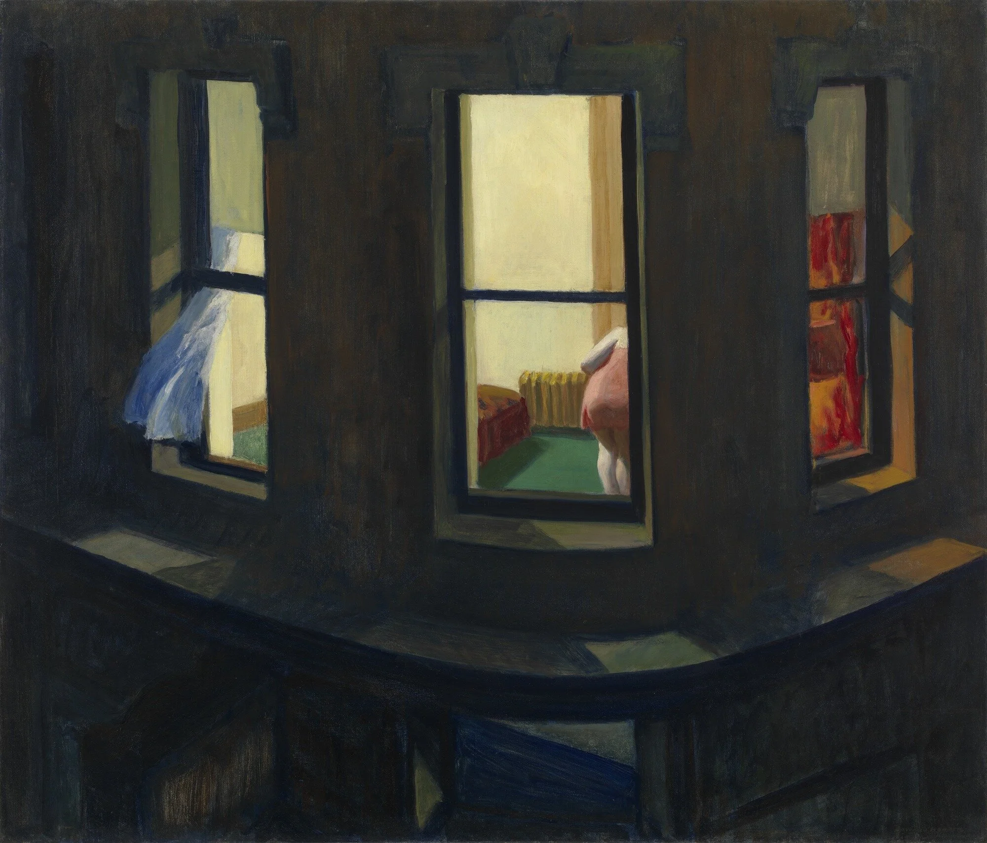
Edward Hopper, Night Windows, 1928, collection of the Museum of Modern Art

Edward Hopper, Night Windows, 1928, collection of the Museum of Modern Art

A year after Automat, Hopper painted another lone female character this time seen in a glancing moment probably viewed from a passing elevated train. We see a tripartite grouping of windows on the rounded corner of a building. At the right, the warm glow of a shaded lamp illuminates a red curtain. In the left, a white curtain is blowing out the open window. In the center we see just part of the figure, leaned away from us and taking part in some obscured activity. She wears a pink slip and the pale Rembrandt-like flesh of her arm and legs are made all the more glaring by the darkness of the structure’s exterior.

Historically, this image has been viewed as a meditation on the type of voyeurism that can easily occur in a city and also as an examination of the duality of urban life. It is an observance of the closeness in which people live with one another and also the existential distance they have from one another.

In cities like New York, where current issues of distance take on a level of actual practical difficulty, this unique relationship of people to one another within space has become starkly clear. Looking at Night Windows now, it becomes more about separation of space and diminution of physical proximity.

Edward Hopper, New York Movie, 1939, collection of the Museum of Modern Art, New York

Edward Hopper, New York Movie, 1939, collection of the Museum of Modern Art, New York

New York Movie, a painting from 1939 which has been in MoMA’s collection since 1941, shows a uniformed theater usher leaning against a wall for a moment of introspection out of view of the few patrons watching a film. In a pool of light cast by a shaded fixture, she leans her head on her hand, supporting her elbow with the flashlight she uses to guide moviegoers to their seats. She closes her eyes just for a moment. The architectural column and wall running down the center of the image form a compositional device to divide the woman on the left from the couple of individuals seated at right. Each of the three characters inhabits their own world within shared space. They are all alone, together.

As movie theaters and other gathering places close, Hopper’s theater takes on a new sense of romance. Places taken for granted in the seventy years since this image was painted are at once precious and missed. And the usher, the type of worker who labors with the public is newly seen by a contemporary audience. People once taken for granted are now essential.

The relationship between service workers, cashiers, custodians and the public is also now more tense and more uncertain. Physical barriers, like the wall in this image, are reconsidered and become vitally important in distancing people from one another. Now, rather than merely benign objects of happenstance, such dividers are seen as necessary safeguards of personal space.

Edward Hopper, Office in A Small City, 1953, collection of The Metropolitan Museum of Art, New York

Edward Hopper, Office in A Small City, 1953, collection of The Metropolitan Museum of Art, New York

In a later work from 1953, Hopper returns again to the subject of the lone figure - this time a man, at a desk staring out a window in Office in a Small City. We see the man externally through a window with crystal clarity. He places his palm on his desk and stares out over the rooftops of a neighboring building which has much more detail, charm, and warmth than the battleship gray facade of his own workplace. Jo Hopper said of the painting that it was an image of “a man in a concrete wall”. That is to say it’s an image of a figure trapped inside the circumstances of his life.

In some regards looking at this today there might be a feeling of jealousy. Oh, to be liberated from the confines of one’s home in favor of an office! But there is also a sense of oneness with the character. We are all looking out the same window, alienated from our surroundings and neighbors.

Edward Hopper, Early Sunday Morning, 1930, collection of The Whitney Museum of American Art, New York

Edward Hopper, Early Sunday Morning, 1930, collection of The Whitney Museum of American Art, New York

Hopper created many iconic images and one of his most recognizable is Early Sunday Morning, a painting completed at the peak of his production in 1930. In it, the variegated surfaces of 7th Avenue facades are at once representational and abstract. The sunlight of dawn casts long unbroken shadows from hanging signs for tailors and barber shops across the windows of closed storefronts. The city, a place normally defined by people, by crowds, by what Walt Whitman called “the glorious jam”, is desolate. It is reduced to architectural and geometric forms - to a picture plane. The peoplelessness of Hopper’s 7th Avenue isn’t just a metaphor for the brooding urban isolation of his time, but also for the physical realities of our own. Looking at the painting in 2020, it becomes less conceptual and more illustrative. It looks like our neighborhoods now look on Mondays, Tuesdays, Wednesdays.

In John Patrick Shanley’s 2005 Pulitzer Prize winning play Doubt: A Parable, the playwright inserts the memorable line “doubt can be a bond as powerful and sustaining as certainty.” The same can be said of our current state of affairs. We are all bound together by doubts, uncertainties, and anxieties. And when we look at Hopper’s protagonists, it is understandable to see much of the same and to feel a new connection to these old pictures.

In a world seemingly much more connected and social than that of twentieth century New York, we are newly aware of isolation and separateness.

So, what can art like Hopper’s provide for us in times of uncertainty, anxiety, and fear? What do these paintings matter? If nothing else, there is something to be said for the reassuring stability of art across time. After all, as they say, art is long, life is brief. Most art, be it the great, the good, or the terrible, will outlast us and for that reason it innately has a tendency to give us something as precious as it is rare: perspective.

Now when we look at Hopper’s paintings we are less likely to see characters that we feel estranged from on the basis of their singularity, but individuals that we feel increasingly more connected to and understanding of. Hopper’s paintings of lone bodies have now become objects of empathic emotion in ways unlike before.

All at once Hopper’s distant, lone characters are knowable and recognizable. That’s because they’re us.

Looking at Henry Ossawa Tanner’s Flight Into Egypt

Henry Ossawa Tanner (American, 1859-1937), Flight Into Egypt, oil on canvas, 1923, Collection of the Metropolitan Museum of Art

Henry Ossawa Tanner (American, 1859-1937), Flight Into Egypt, oil on canvas, 1923, Collection of the Metropolitan Museum of Art

Henry Ossawa Tanner (American, 1859-1937) was one of the most celebrated artists of his generation. His paintings are often emotive and evocative and regularly draw on biblical and spiritual themes to underscore moral lessons. They also regularly employ aesthetic qualities unique to the French-inflected American Art of the late nineteenth and early twentieth centuries, a period when artists in the United States increasingly drew inspiration from their European counterparts. Tanner’s depiction of the Holy Family’s Flight Into Egypt, painted in 1923, is a hallmark of his production. At the current moment in our national history and especially during this holiday season, Tanner’s image takes on a new resonance and a new poignancy.

In the painting, Christ’s mother Mary rides into a gated city while holding the swaddled Jesus. Her husband Joseph follows closely behind. Ahead of their small party a faceless and ghostlike figure carries a lantern which illuminates the scene - the proverbial light in the darkness. The image is executed in a palette which is distinct to the Tonalist-tinted work the artist created throughout his career. Tanner, like many of his contemporaries, was influenced by the French, from Barizon landscapists to Realist painters.

Born in the United States, Henry Ossawa Tanner was one of seven children born to Sarah Tanner, a mixed race woman who had escaped slavery via the Underground Railroad. He studied art under the great Thomas Eakins at the Pennsylvania Academy and moved to Paris in 1891 to study at the acclaimed Académie Julian. Largely due to the racism he experienced in the United States, and also to the cultural opportunities afforded to artists living in Europe, Tanner made France his home for the remainder of his life. He was eventually recognized for his artistic excellence with the nation’s highest honor, being made a Chevalier in the Légion d'honneur.

Tanner also traveled extensively in the Middle East and drew inspiration for his paintings, including Flight Into Egypt from the topography, the architecture, and the people he saw there. His immersive exploration gave way to studied attempts at capturing an authentic view of a cohesive biblical landscape to match the reality Tanner found on the ground in places like Jerusalem. His paintings are marked by this quest for truth and also influenced deeply by his own sincere religious faith.

Tanner was the son of Benjamin Tucker Tanner, a bishop in the African Methodist Episcopal Church. Living abroad on Christmas in 1896, he wrote home saying "I have made up my mind to serve Him [God] more faithfully.” He went on to dedicate the majority of his career to painting touching religious scenes, including this plaintive image executed nearly thirty years after Tanner’s letter to his parents. It is a painting born out of devout sincerity.

The artist’s spirituality is evident in much of his later work, but to me, Tanner’s subtle treatment of many of these images is what makes his oeuvre so striking. Unlike other artists of the mid and late eighteenth century, Tanner largely avoided the negative impulses of the popular Orientalist movement in his scenes of the real places in which biblical stories are set. His paintings are paintings first and foremost - not illustrations meant to aggrandize Western audiences. Nor are they burdened by the saccharine sentimentality which is evident in other images of similar subjects made during this period. Tanner’s dual influences from his uniquely American Christian upbringing and his immersion in avant-garde European movements shaped his art and his psyche.

In Flight Into Egypt we witness not a laboriously produced illustrative image of a scene from scripture, but a painterly treatment of an emotive human story. The subdued palette and quality of the surface of the painting result in a romantic image, which provokes empathy and understanding. The power of this piece is evident because it succeeds at making us feel something nearly a century after it was painted. It allows us to see the humanity of saintly figures and in turn, the people they represent in Tanner’s time and our own.

As the small party marches slowly past the closed doors of a walled hamlet at night, we also find ourselves attuned to a feeling of alienation, which would come to define many paintings made by Tanner and his peers, particularly those in America. There is a lonesomeness to journey of the Holy Family, one mirrored in the religious experience of many. In this case that lonesomeness and solitude is portrayed by a painter who after his death was classified by his own son as a mystic. 

This painting is deeply, resonantly, profoundly beautiful because it transcends what we expect from such a work. It is also a reflection of Tanner’s own transcendent experience which culminated in his success in France. The story of a refugee family would have been incredibly important for the son of a freed slave, just as it should be important to contemporary viewers watching the American border crisis unfold.

Henry Ossawa Tanner was a painter of remarkable skill, who harnessed his own experience and his religious views to create paintings of breathtaking and unusual sensitivity. His Flight Into Egypt is a singular expression of many of the best qualities of his oeuvre and still has lessons to teach to viewers today.

Looking at Vincent van Gogh's The Night Café

Vincent van Gogh’s The Night Café, in the Collection of the Yale University Art Gallery.

Vincent van Gogh’s The Night Café, in the Collection of the Yale University Art Gallery.

In 1888, just two years before he died of an allegedly self-inflicted gunshot wound, Vincent van Gogh was living in rented quarters in the south of France. His time in Arles resulted in some of the most prolific output of his decidedly productive career. This was not just a period of great quantity, but also of great quality. Among the paintings he finished in Arles was an interior scene of the café where he was staying; a painting that many consider to be one of his masterworks. Le Café de nuit or The Night Café, depicts the vividly colored interior of the Café de la Gare, van Gogh’s home  as he continued work on The Yellow House, where he hoped to found an artists’ colony with the likes of Paul Gauguin, who famously departed after a short sojourn as Vincent’s housemate. The Night Café is an unusual painting even within van Gogh’s oeuvre. It is defined by a sense of foreboding and unease. But it is also nonetheless one of his most affecting paintings, and one of my favorites.

In the painting, the viewer is placed in a position of confrontation with the barkeep in an all night café lit by the radiating glow of a series of hanging lamps. This figure, that of the owner, Joseph-Michel Ginoux, stands like an apparition behind the billiard table in the center of the room. He is surrounded not only by drunken derelicts peppered throughout the surrounding space, but also by the thickly painted walls of the encroaching room. This space and the characters within it induce a kind of claustrophobic response, and a sense of the psychic angst. This is entirely by design. Van Gogh said as much of the painting in a letter to his brother Theo.

I have tried to express the terrible passions of humanity by means of red and green. The room is blood red and dark yellow with a green billiard table in the middle; there are four lemon-yellow lamps with a glow of orange and green. Everywhere there is a clash and contrast of the most alien reds and greens, in the figures of little sleeping hooligans, in the empty dreary room, in violet and blue. The blood-red and the yellow-green of the billiard table, for instance, contrast with the soft tender Louis XV green of the counter, on which there is a rose nosegay. The white clothes of the landlord, watchful in a corner of that furnace, turn lemon-yellow, or pale luminous green.  

The color relationships that van Gogh describes, between the greens and reds, et cetera, create the illusion of vibration and dissonance within the space. It is as if, we, the viewers have entered the bar already drunk and unwilling to accept the limitations of a last call. The quaint local tavern becomes a destination of last resort.

The self consciously gritty content of van Gogh’s Café may seem somewhat passé to a modern audience. But consider its place in the history of art and the way this image presages the qualities found in later work by Munch or Kirchner or Hopper. The alienation that would become the hallmark of modernity is encapsulated in this painting of a sleepy night haunt in nineteenth century France. The quality that made this work visionary in its own time also establishes its accessibility and resonance for a contemporary audience. Thus, the subjective outlook of the viewers of 2019 informs the static art of the 1880’s, renewing and reinvigorating it with meanings even the artist could not have envisioned.

Van Gogh’s treatment of the scene, with its scintillating colors, thick daubs of paint, and the innate eeriness of a barely-peopled bar make it all too real in a sense. It is what I, personally, love about this picture. Van Gogh crafts an experience as much as he does a place. Ignore, momentarily, the aforementioned color theory meant to display the passions of humanity, and let the instant the painting shows us sink in. The Night Café displays the knife’s edge of drinking. The painter was a drinker and was intimately aware of the way in which festive friendliness of a bar can slip into something uneasy and even funereal.

That pool table lunges forward, as if the room is about to start spinning. The lights are shining a bit too brightly in the lead up to a hangover headache. The barkeep is a blur, but all too able to pour us out another glass. All of it is very solid, but also on the verge of dislocating. Although van Gogh loved beauty and wanted to paint like the Impressionists he so admired, he couldn’t help but show us the darker side of things – the side he knew all too well. This painting illustrates the goings on within the walls of a building that artists just a few years prior would have described with gauzy delicacy. What van Gogh has given us is something altogether unique and altogether his own, and his gift to art history. He has transformed the angst of the emerging industrialized working class into a space. He converted the dramas of humanity into the architectonics of a pub.

So why should such a painting be lauded as one of the most important by an artist such as van Gogh? Are color theory and narrative intrigues enough to catapult a work into the firmament of a particular zeitgeist? These attributes alone are perhaps not enough, but, combined with the artist’s tumultuous personal story and the role his production played in reshaping the broader imaginative possibilities for all artists, they can illustrate why such a work could be seen as a pendant for something larger. The Night Café represents many of van Gogh’s best qualities including his striving for technical complexity and excellence. It also represents some of the personal struggles that drove his art-making and defined his stylistic aims. It is both quintessential and unexpected. It is a great painting of a bad night out.

A detail from The Night Café, showing abandoned tables and a drinker with his face in his arms.

A detail from The Night Café, showing abandoned tables and a drinker with his face in his arms.

In Black and White: Examining the Recent Market for Drawings by Martin Lewis

The Australian-American artist Martin Lewis (1881 - 1962), a contemporary of Edward Hopper, was a talented and prolific printmaker, though not as widely recognized by the general public as the creator of Nighthawks. Martin’s work is, however, popular in the market for themes that frequently parallel those admired by Hopper’s collectors. Specifically, the market tends to respond well to work depicting evocative urban environments and scenes of New York life in the 1920’s, 30’s, and 40’s. An examination of some recent sales of work by Lewis illuminates a few of the qualities found in his oeuvre that are rewarded in the market.

In Study for Yorkville Night, a preparatory drawing for one of the artist’s numerous prints, figures gather around the pool of light emanating from a storefront below an elevated rail line. The work is executed in ink with apparent ink washes. It has a great range of tonality and developed figurative compositions within the scene. That being said, it does not have the level of detail that would be expected of a finished print by the same artist. This work sold for $13,750 at Heritage Auctions in May of 2018. This sale price was squarely in the house’s estimate range of $10,000 - $15,000, indicating a level of predictability about the market for Lewis’ drawings.

For comparison, the print produced after this drawing sold for $42,000 (over a high estimate of $35,000) a year prior in May of 2017. Previous sales of the same print image for $26,400 in 2008 and $35,000 in 2016 are indicative of increasing interest on the part of collectors in Lewis in general, his prints more specifically, and this image in particular. This intense interest appears to be mostly correlated to the artist’s prints and it is important to note that such enthusiasm does not always translate across media. When examining recent sales of Lewis’ drawings this is an important detail to be cognizant of.

One question arising from the comparison between the drawing and print sales of Yorkville Night is why would a drawing, which might be considered the more “original” of the two works, sell for so much less, especially at the same auction house? One potential answer to this is that Lewis is primarily known as a printmaker, so the market response will tend to be stronger for his “primary medium”. Another issue is that the drawing in question is almost certainly preparatory and therefore might be considered by some collectors to be an “unfinished” work. In the print, the artist’s intention for the final and complete work is evident. Therefore, it becomes the more desirable work even though it is a multiple. While this is not an uncommon phenomenon, it can be illustrated well in this case.

Variations between the auction and retail markets for Martin’s work are also important when considering varying levels of market response to his drawings. A Study for Yorkville Night is currently on offer in a retail setting at The Old Print Shop for $35,000. This retail price is roughly double and a half the auction price, which is common for a retail setting.

Importantly, a simpler Yorkville Night study executed in graphite and conté crayon is held in the venerable collection of the Detroit Institute of Arts. So, the Study can rightly be called “museum-quality”, an often misused descriptor in the commercial art gallery setting.

Martin Lewis, Study for Yorkville Night, ink and pencil on paper, 8.63" x 11.88", unsigned and undated Sold for $13,750 at Heritage Auctions (Estimate: $10,000 - $15,000)  Sale date: May 4, 2018, Lot #68185

Martin Lewis, Study for Yorkville Night, ink and pencil on paper, 8.63" x 11.88", unsigned and undated
Sold for $13,750 at Heritage Auctions (Estimate: $10,000 - $15,000)
Sale date: May 4, 2018, Lot #68185

Martin Lewis, Yorkville Night, drypoint, 8.5” x11.5”, edition of 18, signed  Sold for $42,000 at Heritage Auctions (Estimate: $25,000 - $35,000)  Sale date: May 7, 2017, Lot #355 Same image sold in 2016 for $35,000, in 2008 for $26,400 It was also o…

Martin Lewis, Yorkville Night, drypoint, 8.5” x11.5”, edition of 18, signed
Sold for $42,000 at Heritage Auctions (Estimate: $25,000 - $35,000)
Sale date: May 7, 2017, Lot #355
Same image sold in 2016 for $35,000, in 2008 for $26,400
It was also offered in 2001 and 2002 for estimates of $1,500 - $2,000 and was unsold both times via Swann

In another work, the undated watercolor On The Bridge, Lewis handles a daytime scene of commuters traversing a bridge. Like Yorkville Night, the work shows one of Lewis’ central themes: the interaction of figures within nakedly urban environments. This work is larger than the preparatory drawing for Yorkville Night and also considerably more “finished”, yet it sold for the same price ($13,750) just three days prior to the sale of Yorkville Night. Again, the reason for this seemingly surprising result might have to do with the expectations of collectors. Lewis is known for depicting rich dramas of New York night scenes. Daytime imagery is inherently less dramatic, and therefore potentially of less interest to the types of individuals who will vie for his work in the auction setting.

In this watercolor, the focal point of the scene is the atmosphere of the city highlighted between the girdered superstructure of the bridge. While the figures and architectural elements are finely described, the city beyond and the sky above are loose and gauzy. Because collectors tend to respond to Lewis’ prints and to works on paper that exude a strong use of line, a looser treatment would likely be less attractive to the core pool of buyers who help to drive sales results. It also is highly possible that the sale price of this work informed collector response to Yorkville Night, which again sold at Heritage Auctions three days later.

Martin Lewis, On The Bridge, watercolor on paper, 17.75" x 20.75", signed and undated Sold for $13,750 at Doyle New York (Estimate: $10,000 - $20,000)  Sale date: May 1, 2018, Lot #133

Martin Lewis, On The Bridge, watercolor on paper, 17.75" x 20.75", signed and undated
Sold for $13,750 at Doyle New York (Estimate: $10,000 - $20,000)
Sale date: May 1, 2018, Lot #133

In yet another work on paper, a loose drawing titled Night Windows, an apartment building topped with a water tower is silhouetted in the misty twilight. This work furthers an understanding of Lewis’ process; from loose studies, to more refined drawings, to finished prints. This work is slightly smaller in scale than Study for Yorkville Night. It sold for $5,000 at Shannon’s Fine Art Auctioneers in 2018, down from a $5,760 sale price at Swann Galleries in 2009. This result shows a clear decline in value for this individual object. This decline appears to be rather unique to this object and its situation, as sales of other work by Lewis have tended to remain strong over time.

Another question that might come to mind is why would a drawing such as this lose value as other works by Lewis such as Yorkville Night rise in value? Again, the answer is almost certainly linked to collector expectations and desires. This work is quite loose and lacks the detailed description which tends to be rewarded. It is rather abstract and illustrates the artist’s process but not the finer details of his more complete works. There is also a great deal of competition in the marketplace, and high quality prints by Lewis become available in a variety of auction settings regularly. Competition rewards works of high quality and is less kind to works that are of less interest to passionate collectors.

It is important to note that this piece has even less “finish” than Study for Yorkville Night. It also has no clearly developed figures, which are often central to the artist’s most popular works. Although there is some evidence of a figure in one of the windows at lower left. Again, Lewis’ oeuvre is known for the presence of characters interacting in urban spaces. It is still a wonderful drawing in many ways, and again, a great indicator of the artist’s process. But as the sale price indicates, it is of less interest to the market than other works by the same artist.

Martin Lewis, Night Windows, graphite on paper, 10.5” x 8”, unsigned and undated Sold for $5,000 at Shannon’s Fine Art Auctioneers (Estimate: $4,000 - $6,000)  Sale date: April 26, 2018, Lot #149Same drawing sold for $5,760 in 2009 at Swann Gallerie…

Martin Lewis, Night Windows, graphite on paper, 10.5” x 8”, unsigned and undated
Sold for $5,000 at Shannon’s Fine Art Auctioneers (Estimate: $4,000 - $6,000)
Sale date: April 26, 2018, Lot #149

Same drawing sold for $5,760 in 2009 at Swann Galleries.

Finally, in another drawing, New York Nocturne, the qualities that truly excite the market for Lewis’ drawings are very evident. The work, executed in charcoal around 1930, shows two figures on a street in New York. One person stands on the sidewalk while the other is prone. Both individuals are framed below the black underside of an awning. There is an element of mystery to the subject and it is not immediately evident whether these two men are friends stumbling home drunkenly from a bar, or whether one is a passerby stopping to glance at a homeless person asleep on the street.

The image bears a great deal of linear description that is architectural in quality. It also has a range of tonalities that describe the way in which street light and ambient moonlight affect facades within an urban setting. This treatment would likely be of great interest to the type of collectors that seek out, and pay high sums, for Lewis’ intricately detailed prints.

This work sold for $47,500 over an estimate of $10,000 - $15,000 at Swann Galleries in 2018. This illustrates that there can be interest in Lewis’ drawings equal to that of prints, when the drawing in question is of exceptional quality. Some of the positive attributes of the drawing in question are that of line, contrast, and narrative drama. All of these, and more, add up to a work that is naturally of great interest to serious collectors.

Martin Lewis, New York Nocturne, charcoal on paper, 12.75" x 16.88", c. 1930, signed Sold for $47,500 at Swann Galleries (Estimate: $10,000 - $15,000)  Sale date: March 13, 2018, Lot #166

Martin Lewis, New York Nocturne, charcoal on paper, 12.75" x 16.88", c. 1930, signed
Sold for $47,500 at Swann Galleries (Estimate: $10,000 - $15,000)
Sale date: March 13, 2018, Lot #166

This brief examination of just five recent sales of works by Martin Lewis does not provide a complete picture of the market for his work more broadly, but illustrates some of the key issues that inform value in his drawings. Each of the works presented has their own unique qualities, but the market response to each was informed by the values of those in the market for such work at this time. Because most of the sales cited here took place in 2018, these few sales provide a snapshot of the diverse market attitudes that can exist at one time.

Lewis was a prolific artist in multiple media and his work comes up at auction regularly and is also readily available in the retail setting. The market for his work is strong, and the response of collectors to the variety of his production is fascinating. Many artists of Lewis’ generation are not as well represented in the marketplace. Still others, such as Hopper, are much more widely known and more well publicized than Lewis. Generational peers are not always equal in the market. Collectors do truly tend to look at artists and artworks with deeply individualized values and opinions.

This post should serve to aid in broadening a better understanding of some basic market opinions about one specific artist during a singular time period. With a better understanding of how the market reacts to work like these by Lewis, collectors, dealers, and even living artists become more informed and more ready to deal with the realities of the current market for fine art.

Looking at George Wesley Bellows' Pennsylvania Excavation

In 1907, the construction of Pennsylvania Station was well underway in the heart of Manhattan. A vast swath of Midtown was razed to make way for a huge Beaux-Arts rail hub that would connect New York to the rest of the United States and cement the city’s place as the most significant metropolis in the country. George Wesley Bellows was in his mid-twenties in 1907 and, having studied under Robert Henri at the New York School of Art, was a member of the contemporary art movement known as the Ashcan School. Along with artists like Henri, John Sloan, George Luks, Williams Glackens, and others, Bellows explored the urban life of New York City in a raw realist style. The construction of Pennsylvania Station, as an exemplar of the continued, complicated ascent of New York, was a source of inspiration for Bellows and other Ashcan painters. In his 1907 painting Pennsylvania Excavation (gifted to the Smith College Museum of Art in 2010 by 1960 Smith graduate Mary Gordon Roberts), Bellows paints the scene with incisive honesty and, in doing so, expresses the urban condition at the turn of the century.

George Wesley Bellows, Pennsylvania Excavation, oil on canvas, 1907, Smith College Museum of Art

George Wesley Bellows, Pennsylvania Excavation, oil on canvas, 1907, Smith College Museum of Art

In Bellows' image, the void that will make way for the great Station is all-consuming; its enormity accentuated by the minuteness of two figures and a steam shovel in the foreground. The figures are workmen, laborers whose toil will bring about one of the technological and architectural marvels of the twentieth century. But in the face of the project they are dwarfed by empty space seemingly at the fringe of civilization. In the distance the skyscrapers of lower Manhattan stand, not as glittering idols but as a lifeless wall of gray. Progress is not always pretty. And here, progress comes in the form of a barren canyon buried under snow and soot. The promise of modern life is reduced to a bleak and colorless wasteland.

Detail of the Manhattan Skyline in Bellows' Excavation

Detail of the Manhattan Skyline in Bellows' Excavation

The composition of the scene is a stone's throw from Bruegel's Harvesters. In both images the land and the work associated with it are visually insurmountable, outscaling the humans tasked to them. In Bellows' New York, Breugel's peasantry is replaced by the proletariat. For Bellows, urban life was not a subject to be idealized, but one to be shared in order to express truth. Realism would elucidate reality, and in doing so share a new verity: the lived experience city dwellers in the United States at the tail end of the Gilded Age. As cities became the center of American culture, they also became flashpoints for the massive inequality that afflicted American society.

Formally, the painting mirrors its Renaissance antecedent while at the same time pushing the boundaries of representational painting. Bellows borrows the atmospherics of Turner and the central chasm becomes a rugged abstraction, an expression of the chaos of the place and time depicted. Paint is dashed on and carved out in a grisaille of destruction and construction. As changes come to the extensive work site, the city is also transformed. The station that would rise from the rubble of a vibrant neighborhood would become a landmark of elegant modernity. Bellows depicts this decisive moment with gritty realness and thereby shares the truth of progress: that it is messy and comes with great difficulty.

Detail of workers and steam shovel from the foreground of Bellows' Excavation

Detail of workers and steam shovel from the foreground of Bellows' Excavation

Pennsylvania Excavation is a fine example of Bellows' work and an insightful piece from the Ashcan School, a movement that was uniquely New York in its founding and uniquely American in its scope. In paintings like Bellows', he and his contemporaries explored the truth of the American scene in the early part of the twentieth century and the innumerable ways in which average people would shape the national identity. Through images of urban development and redevelopment with zealous actuality, Bellows and his peers created a movement that expressed the experience of a nation increasingly centered around its cities and their growth.

More than one hundred years on from Pennsylvania Excavation, the original Penn Station has long been demolished and replaced. The life of the city and the country has gone on. But in the early part of the twenty first century, as American populations shift back to city centers and metropolitan life, there is still much to be learned from the urban realism of Bellows and the Ashcan School.

John French Sloan's Ashcan Nudes

John French Sloan (1871-1951) is likely best known as one of the key members of the Ashcan School, the rough association of realist artists working primarily in New York at the turn of the century. Sloan's oeuvre is full of the gritty streetscapes typical of his movement. Some of his most well-known paintings like Dust Storm, Fifth Avenue, of 1906, Six O'Clock, Winter, of 1912, or The City from Greenwich Village, of 1922, convey a sense of the complex relationships between New Yorkers and their urban environment. From the beginning of the twentieth century into the depths of the roaring twenties, such images shape an understanding of what it meant to be a New Yorker and, more broadly, an American. Like his peer Edward Hopper, Sloan had a keen sense of the isolation and loneliness that often accompany life in a vast and impersonal metropolis. Upon closer inspection though, Sloan's body of work contains some unexpected images, including a series of nudes produced throughout his career. These images, often executed as etchings, capture solitary moments of female models in the artist's studio. They are artworks full of disparate qualities. At once sensitive and personal, they are also incredibly retrograde. They express, perhaps accidentally, the uniquely precarious relationship between artist and model, while also exhibiting the patent objectification of women which makes female nudes so problematic.

John Sloan (1871–1951), Prone Nude, etching, 1913, 3 1/4" × 6 7/16" (plate), Gift of Mrs. Harry Payne Whitney, 1926, Metropolitan Museum of Art

John Sloan (1871–1951), Prone Nude, etching, 1913, 3 1/4" × 6 7/16" (plate), Gift of Mrs. Harry Payne Whitney, 1926, Metropolitan Museum of Art

In an early work, Prone Nude, of 1913, Sloan references the canonical nude prototype. His model copies, with a few alterations, the infamous pose from Paul Gauguin's Spirit of The Dead Watching (Manao tupapau), a painting created twenty years earlier in Tahiti, which depicts Gauguin's terrified native wife Teha'amana laying prone on their bed. Sloan's use of the etching process flips the pose, mirroring his own subject to Gauguin's. While Teha'amana spreads her hands slightly in the earlier painting, the model in Sloan's etching half buries her face in folded arms. Both figures tightly cross their ankles and stare out chillingly at the viewer.

The gesture in Sloan's Prone Nude in the final etching also coincidentally recalls that of Francois Boucher's scandalous la Jeune Fille allongée, a portrait of Marie-Louise O'Murphy, the petite maîtresse of Louis XV. Both Gaguin's and Boucher's subjects were underage girls, bound by overtly patriarchal societies to take part in relationships that are unthinkable today. Even without the contextual baggage of Gaguin and Boucher, neither of these associations is a particularly positive one, as both are images of women presented exclusively for objectification. Sloan does not seek to correct the issues with the earlier exemplars, and instead presents a woman along the same lines as Gauguin and Boucher, devoid of agency or power in the face of the presumably male gaze. This continuity remains in Sloan's later depictions of women.

John Sloan (1871-1951), Nude Reading, 1928, etching, 5" x 7" (plate), Gift of Bernard F. Walker, Detroit Institute of Art

John Sloan (1871-1951), Nude Reading, 1928, etching, 5" x 7" (plate), Gift of Bernard F. Walker, Detroit Institute of Art

In another etching, Nude Reading, completed fifteen years after his Prone Nude, Sloan makes an image more his own. A nude model, presumably resting between poses, lounges on a bed while leisurely perusing a thick book. In the background, the artist's press is littered with materials. The scene is outwardly beautiful and meditative, but shares the same issues with Sloan's earlier Gauguin-inspired print. The woman is depicted in a one-to-one relationship with an object: the press. As the press has "a bed", the model lays on a bed. The insinuations of model as a tool of the artist, no different than a press, are obvious. The work is also a meditation on the process of creating the etching. The subject is present and so is the press on which this very print was likely created. In addition to revealing aspects of the artist's creative process though, it also presents a decidedly traditional view of the model's role in the creation of such work, as a passive object.

John Sloan (1871-1951), Nude and Etching Press, etching, 1931, plate: 4 15/16" × 3 15/16" sheet: 12 11/16" × 9 5/8", Gift of Ernest Shapiro and Family 1995, Metropolitan Museum of Art, New York

John Sloan (1871-1951), Nude and Etching Press, etching, 1931, plate: 4 15/16" × 3 15/16" sheet: 12 11/16" × 9 5/8", Gift of Ernest Shapiro and Family 1995, Metropolitan Museum of Art, New York

In 1931, Sloan revisits the model and press motif in Nude and Etching Press. This time the figure stands with some discernible confidence next to the artist's press. The lithe arms of the anonymous woman replicate the outstretched "arms" of the press. The curvilinear qualities of the press's legs mirror the shapely legs of the model. Again, Sloan presents a woman one-to-one with an object. Neither this figure, nor the Nude Reading, interact with the press at all. Both merely pose in front of the it, and are nearly as still as Sloan's early Prone Nude. Both images elevate and personify the press, while simultaneously diminishing the humanity of the model. This piece, like the earlier nude paired with the press, is an apparent study of the artist's process. Tacked up haphazardly on the wall above the press are nearly a dozen nudes. Perhaps the model here is stretching between more formal poses, with the knowledge that her image too will be added to this collection.

John Sloan (1871-1951), Nude and Arch, etching and engraving, 1933, 7" x 5", on offer at Swann Auction Galleries March 13, 2018 19th Century Prints and Drawings Auction (Est. $1,500-$2,500) This work was Unsold.

John Sloan (1871-1951), Nude and Arch, etching and engraving, 1933, 7" x 5", on offer at Swann Auction Galleries March 13, 2018 19th Century Prints and Drawings Auction (Est. $1,500-$2,500) This work was Unsold.

Another Sloan nude appeared in Swann Auction Galleries' recent Prints and Drawings sale on March 13. The work, which went unsold, comes two years after the Nude and Etching Press, and features a  model seated uncomfortably on a cushion in front of a window overlooking Greenwich Village. Stanford White's Beaux Art Washington Square Arch stands in bright sunlight in the eponymously named park, framed in the window behind the model. Scenes of city life are also evident, as cars can be seen through and around the arch. Windows of the apartment blocks abutting Washington Square Park form a further backdrop, and an added urbanity. The wrought iron railing and arch give the scene a vaguely Parisian air, imbued with the distinctly Bohemian feeling of the Village in the twenties and thirties. The model here is much more engaged with the viewer than her predecessors, staring out at us wanly. Still though, she is presented one-to-one with an object: the arch. The classical associations of arch and nude are quickly evident. Here though they are updated to New York in 1933, the Città Eterna of the New World.

In all of these pieces the aesthetic values of the Ashcan School are laid out in the medium of the etching. Richly and darkly inked, each plate is thick with crosshatching. Even the smooth-skinned model is criss crossed with descriptive lines. Sloan clearly revels in the textural and linear qualities inherent to the printmaking process and tends to fill the whole field of the plate with lines, independent of their necessity to express value or space. This technique results in prints that are as course as his paintings of metropolitan life. In terms of execution, these images hold together with a stylistic coherence that spans much of Sloan's career.

The problems present in Sloan's portrayals of his models are rather obvious to contemporary onlookers, if not unusual in his own day. The use of models to hone hand-eye coordination and express supposedly universal or eternal artistic values was a time honored tradition and would have been a key point in Sloan's education at the Pennsylvania Academy of Fine Arts. It is difficult, though, to reconcile the avant-garde nature of so much of Sloan's oeuvre with the way in which he envisaged nude women. He was a leader of a liberal art movement, an avowed communist, and a rebellious spirit, yet his depictions of women are ensnared by many of the trappings shared by more conservative artists.

While they do offer access to usually unseen moments in the artist's studio and creative practice, these nudes also engage in typically misogynistic portrayals of female bodies. They can and should be appreciated for their craftsmanship, for their ability to show Sloan's process, and for their storytelling capability. But they are surprisingly out of step with the values evident in Sloan's life and in his broader body of work.

Exploring American Art in the Nineteenth Century

On October 22 I gave a talk at the Bristol Art Museum on the Providence Art Club, and in the course of preparing for this presentation I revisited my art history and my history to get a better look at the year of the Art Club's founding: 1880. Something that came to mind immediately was the proximity of the Club's beginning to the end of the American Civil War, which concluded just fifteen years prior. For comparison, 2017 is of course just sixteen years after the events of September 11, 2001. This correlation made me curious to explore the War's enormous impact on the cultural life of the United States.

It is difficult, or maybe even impossible, for contemporary Americans to imagine what life in the mid and late nineteenth century might have been like in the same country where they now reside. The culture of nineteenth century America was quite different, the nation still so unshaped, that it is as if the Civil War took place in an entirely other country than our own. But the after affects of the conflict shaped the country that we know today. Just one aspect of the changing and coalescing of American society that took place during the Reconstruction Period was in the area of art and culture.

Before the War, and for decades after, the United States was viewed as a cultural backwater. Bereft of their own art institutions, most American artists traveled abroad to study. In ateliers in Paris, hundreds of Americans worked under the tutelage of French artists who themselves were trained in proper academies using well-worn and respected techniques espoused by the art establishment. This temporary diaspora created a class of cultural ex-patriots the likes of which would not be seen again until The Lost Generation of the 1920's.

Scores of these art pilgrims returned to their country to create art with European skill and American vision. And in doing so, these artists realized that the United States would require cultural infrastructure if their momentum was to continue. Artists along with patrons and the growing mercantile and economic elite drew together to create the necessary institutions that would underpin a burgeoning American art scene. Many of the organizations founded to serve the cultural needs of the nineteenth century found a staying power that continues into the twenty first.

An early exhibition at the Providence Art Club, about 1890, founded in 1880 to stimulate "art culture" in Providence, RI. The Club utilizes the same gallery space for exhibitions today.

An early exhibition at the Providence Art Club, about 1890, founded in 1880 to stimulate "art culture" in Providence, RI. The Club utilizes the same gallery space for exhibitions today.

In the period between 1865 and 1900, an astounding number of cultural organizations were formed in the United States. Primarily in the wealthy North; philharmonics, libraries, literary societies, social clubs, private studios, art schools, associations, and museums sprung into existence. Many of these were funded by the wealth being piled up in a country whose rapid industrialization was sparked by the disastrous internal conflict of the Civil War. The vast irony of the creative output in the post-bellum era is that the industrial complex that abetted the War was also, at least indirectly, responsible for the cultural flowering that occurred in its aftermath.

The types of organizations that grew up after the War were myriad. They were professional associations, museums, and institutions of higher learning. The Yale School of Art, Rhode Island School of Design, the Pratt Institute, and the Corcoran College of Art and Design all came into existence in this period. Along with other art schools and private ateliers, they made it possible for the first time to educate American artists at home. This broadened the base of art makers and expanded, democratized, and Americanized points of view presented in the art created in the United States.

In the decade and a half after the War, a slew of art museums were founded, too. These institutions, and their wealthy patrons, would bring the treasures of the world to the United States. Many of the nation's preeminent encyclopedic museums were established in the frenzied nineteenth century, including the Detroit Institute of Art, the Art Institute of Chicago, the Philadelphia Museum of Art, the Museum of Fine Arts, Boston, and the Metropolitan Museum in New York. Smaller museums like the Worcester Art Museum in Massachusetts and the Museum of Art at the Rhode Island School of Design in Providence also came into being. Together, the establishment of such institutions is indicative of the widening audience for culture. As the middle class grew, more Americans were interested in the entertainment possibilities inherent in an art museum.

In the middle of this period, another organization was founded. Not a school, or a museum, but a professional association and social club meant to bring artists and collectors together for the pursuit and patronage of art. In 1880, in Providence, Rhode Island, sixteen men and women came together to found the Providence Art Club. Dedicated to stimulating "art culture" in the City of Providence and beyond, the Club would provide a collective impulse for exhibition and networking.

Some early members of the Providence Art Club, circa 1890.

Some early members of the Providence Art Club, circa 1890.

The Club was the first such organization to be co-founded by men and women, forty years before the female founders of the Club would be eligible to vote. The second individual to sign the Club's constitution was the great African-American landscape painter Edward Mitchell Bannister. This community, diverse and potentially radical in its day, made it possible for artists and patrons to meet, and for artists to exhibit their work outside the constraints of traditional commercial galleries.

Over the course of the last 137 years, many of the aforementioned organizations have thrived and grown. The Art Club is no exception. Since 1880, the Club has ballooned from 16 members to over 600, and it organizes more exhibitions now than ever. On November 12, the Club opened The 113th Annual Little Pictures Show & Sale, the largest and oldest exhibition of its kind in the United States. The endurance of the Art Club is indicative of the quality inherent in many other organizations established in the same period. Though established for decidedly nineteenth century needs, the Club continues to serve today's artists and patrons in the same tradition, albeit with expanded and modernized services.

In revisiting the period of the Art Club's founding, I came to appreciate the Club more for its historical role in bringing artists and patrons together. While art schools and museums provided much needed venues to education and inspiration, the Art Club was a practical necessity for mid career artists eager to court new patrons. The fact that six women, and an African-American were so integral to the founding of the Club adds to the organization's particular uniqueness within its milieu.

The broader story of American culture at the end of the nineteenth century is one of a country returning to normalcy after an internal calamity. Economic progress partially sparked by the Civil War resulted in an environment where burgeoning art organizations were able to thrive. The Robber Barons of the Gilded Age underwrote institutions which eventually came to serve diverse audiences all over the United States. Contemporary Americans ultimately owe a debt of gratitude to the artists and connoisseurs of the nineteenth century. Their enormous investment in a cultural infrastructure for a cultureless nation continues to pay dividends today.